What is UI design, and why is it vital for your website?
If you’re asking yourself ‘what is UI design?’ you’re not alone. UI – or ‘user interface’ – design gets confused with user experience design because there’s overlap between the two disciplines. Even in the digital industry the terms are often lumped together and called UX/UI design.
As a result, UI design is sometimes overlooked by businesses. But it’s vital for creating a successful website. If you focus on UI design as a separate discipline, your website will have the edge. A well-crafted user interface benefits both your customers and your business. You’ll get more engagement, conversions and customer loyalty.
In this guide, I’ll tell you everything you need to know about UI design so you can create a better website for your customers.
I’ll answer the question, ‘what is user interface design?’, and explain how it’s different from UX design. I’ll give you some compelling reasons why the discipline is so important for your site. Lastly, I’ll outline key UI design principles, and give examples of good, bad and downright ugly user interfaces, so you can see those principles in action.
What’s the difference between UX and UI design?
The terms UX and UI get merged or used interchangeably. But they’re not the same thing.
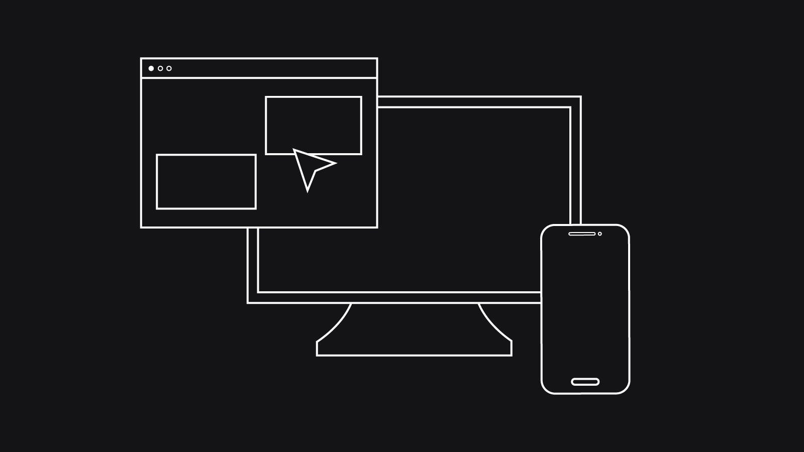
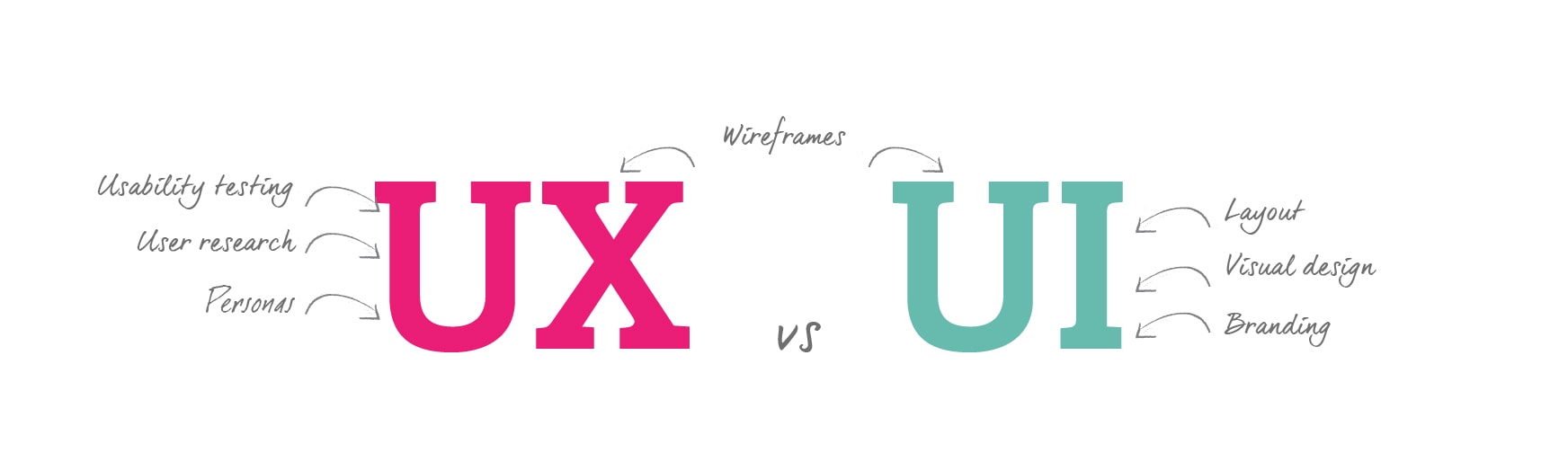
User interface (UI) design is about your website’s appearance. It involves developing your website’s look and feel – it’s interface – by the creation and arrangement of the site’s visuals including the layout of a page, the text and the buttons.
Good UI design ensures elements like colour, shape and typography combine to guide the user. The goal of UI design is to create an interface that’s appealing and easy to interact with.
On the other hand, user experience (UX) design is about your website’s performance. UX addresses how the website as a whole functions to meet the user’s needs. It involves analysis and testing to make sure navigating the site is logical, user journeys are efficient and load times are fast.
UX design ensures the website’s content, structure and systems all combine in the right way to deliver an efficient and enjoyable experience.
A handy way to remember the difference is to imagine the design of a car. The UX designer will be concerned with the owner’s overall experience of the car from admiring it, sitting in it, driving it and maintaining it. A UI designer will be concerned with how the owner will interact with tangible elements like the dashboard.
Why is UI design so important for your website?
Perfecting your UI is important because visuals are the first thing we’re drawn to when we visit a website. We rely on visual prompts and patterns to help us find our way around.
But, visuals aren’t just useful cues, they affect us at an emotional level too. We make judgements about a company based on how its website looks. Here are 7 more reasons why UI design is vital for your business:
1. Good web design is everywhere
Your customers have lots of good websites to choose from. To stand out from the rest, you need to up your game with strong visuals.
2. First impressions count
Visitors to your site decide to stay or go at a glance. They’ll make that decision based on your website’s appearance.
3. An effective UI builds trust and credibility
If we visit a site with great visuals, we’ll assume the company is credible even if we don’t know anything else about it. If your website looks and feels professional, customers will have confidence in you.
4. A good UI enhances your brand and increases customer loyalty
Well-designed visuals make an emotional connection with the viewer. That means visitors are more likely to remember you, return to your site and recommend you to others.
5. It’s good customer service
Invest care and thought into making your website appealing to customers and they’ll feel valued. Because an effective UI makes it easy to find info and perform tasks, it’s less likely they’ll need to contact you to resolve issues.
6. You’ll be more accessible to more customers
A clean and intuitive interface is more accessible to more people. A fiddly, confusing interface could be challenging for older or disabled customers and annoying for busy ones.
7. A good UI increases conversions
An intuitive interface means you’re more likely to guide visitors to conversion. If it’s a clear and simple process, customers will want to engage with your site again.
Key UI design principles
Keen to learn how to perfect your website’s UI? The good news is you don’t need to create a flashy site with all the latest bells and whistles.
A great UI is so unobtrusive that users forget it’s there and become fully immersed in their own goals. Read on for the low-down on creating an effective user interface:
Know your audience
Before you start to design your UI, it’s a good idea to get to know your users so you can give them what they want. What info will they need and what actions will they want to take? How tech-savvy are they? Learn their preferences through feedback, buyer personas or surveys.
It’s helpful to consider how your users expect to perceive you. Do you need to appear business-like and reliable? Vibrant and exciting? Use colours and elements that project the right message.
Keep everything consistent
Consistency is vital for your UI. Not only does a consistent look and feel enhance your brand, but users will quickly get confused if your layout changes from page to page. Keep to the same colour scheme, navigation and layout across your site. This will give users the sense of being in control and makes it easier for them to perform new actions.
Create a visual hierarchy
Every page on your site should have one main purpose, and the visual elements should guide your user towards it. Do this by creating a visual hierarchy. Bigger and bolder elements will draw the eye first, so display the most important info prominently with a larger typeface. You can also make essential elements like CTA buttons stand out by contrasting colour, typography and texture.
Make it familiar
Have you ever been on a website and tried to pinch and zoom, but needed to find a button that did the job instead? Remember how annoyed you were? Users hate being made to think, so your visual elements should look and behave in a predictable way. Similarly, your layout should be familiar, with features like menus where users would expect to find them.
Less is always more
It can be tempting to add elements just to look pretty, but resist. Everything needs to have a purpose, otherwise it will confuse or distract your user.
It’s a good idea to start your UI design with just the bare bones – only the features and elements that are absolutely necessary. Then add elements only if you think they contribute to your page’s purpose. To make your content easy to view and pleasant to look at, frame elements generously with whitespace and keep text at the same alignment.
Make it responsive
Unless you’re designing a mobile app, your UI needs to work intuitively on any device. Best practice is to use software that supports an adaptive layout, so your Ui will retain a clean appearance on different screens. Make sure your UI supports mobile gestures like swiping and that your interactive elements, like navigation buttons and contact forms, are large enough to be touch-screen friendly.
Don’t keep users guessing
Visual cues or simple messaging will keep your users in the loop, letting them know instantly whether an action’s been successful. Include loading animations and screen transitions to keep customers engaged. Don’t bombard your user with too much info all at once though. Break tasks into steps, and disclose only relevant info at each step.
Be forgiving
Even when a UI’s beautifully designed, it’s inevitable that users will make mistakes. Your UI needs to allow for human error. It’s a good idea to make it easy for users to undo actions and create messages that teach the user what went wrong – and how to fix the error second time around.
Good and bad UI design examples
The best way to see how UI can make or break a website is with real-world examples. Want to take a look at some great, mediocre and awful UI design? First off, feast your eyes on some websites that get their UI spot on:
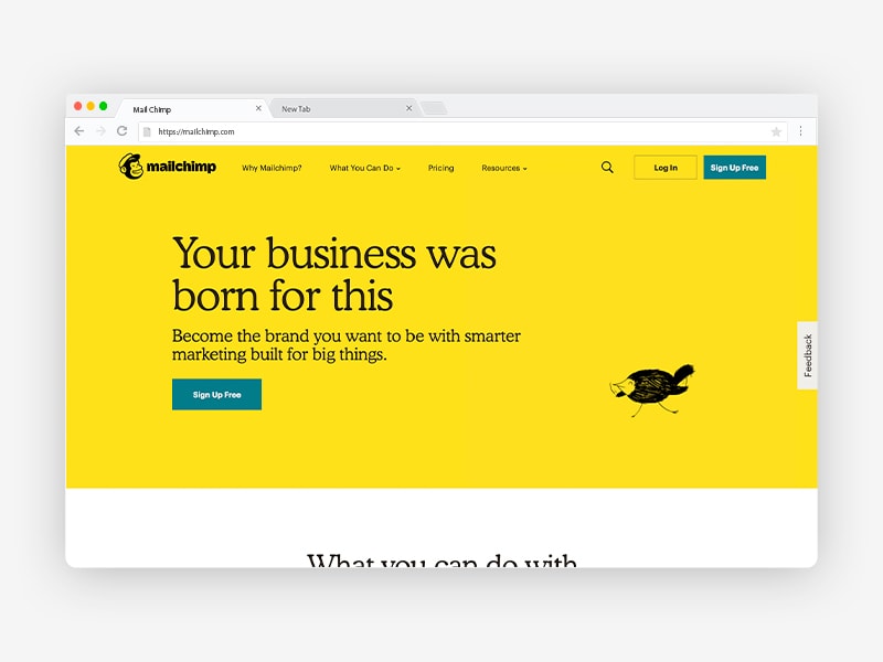
Mailchimp
Mailchimp makes the dull task of setting up newsletters fun with a vibrant, intuitive UI. The layout’s simple and bold, with lots of whitespace, clear CTAs, minimal text and a limited colour scheme. The pared-down look is balanced by quirky images and animations that help the user make an emotional bond with the site.
The UI walks new users through the process of setting up a mailing list with helpful, visually appealing guides. And if you do go wrong, the error messages are witty, too.
Wolf and Badger
Wolf and Badger is a shining example of a well-laid out ecommerce site. The design doesn’t try to reinvent the wheel but makes everything really easy to access. Menu, style guide and new trend sections are positioned where you’d expect them. From the homepage there’s lots of info and links to choose from. Thanks to the minimal copy, whitespace and consistent image and text arrangement, it doesn’t feel too busy.
Add something to your bag, and up pops a confirmation it has been added with the option to jump straight to checkout. If you want to get in touch with them, contact details are easy to spot at the top of every page.

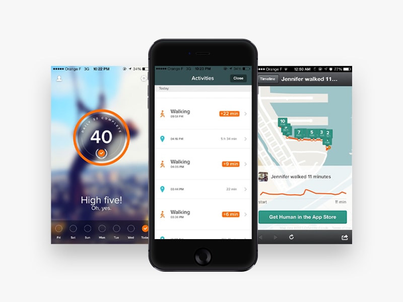
Human
Human is a fitness app for IOS and Android. It offers free all-day activity tracking and the fitness stats of major cities, encouraging you to be active through healthy competition. The stylish UI has a high-contrast colour palette to view info at a glance. It’s easy to find what you’re looking for thanks to its simple layout and clear visual hierarchy, while inspiring photography and animations help to motivate users.
Next up, here are some examples of poor UI design. While we don’t always consciously register a well-designed UI, it’s more obvious when a UI has a poor layout, bad aesthetics or errors. Brace yourself:
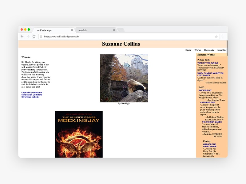
Suzanne Collins’ website
Suzanne Collins is the author of the fast-paced and futuristic Hunger Games novels. You’d expect her website to have a sleek and dynamic UI to match her brand. But, the interface is disorganised and dated, with badly aligned text and a clumsy layout. Prominent images of her books aren’t linked to their description page, and lengthy wall-of-text blocks of copy are hard work to read. To make things worse it’s not mobile-friendly either.
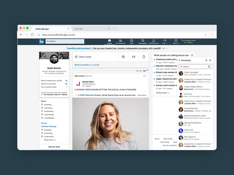
Proof that big organisations can get it wrong too. The networking site for professionals has a surprisingly lacklustre UI.
The design isn’t ugly, but it’s very cluttered, making navigation and finding info a challenge. The homepage lacks hierarchy and contrast, and there’s a lengthy list of icons along the header, some of these are easy to identify but some are more cryptic. For example, the ‘My Network’ icon displays people you might know centre-stage but relegates your existing connections to a side bar.
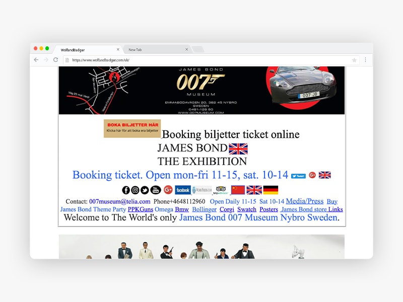
007 Museum
Finally, here’s an example of a UI in chaos: the website for Sweden’s 007 museum. Important info like prices, opening times and exhibits are hidden amongst random images and a sea of hyperlinks. The layout clashes instead of being consistent, and there’s no coherent menu system. Videos play automatically and in tandem, sure to scare the living daylights out of users.
So there you have our essential guide to UI design: what it is, why it matters and how you can perfect it to boost customer engagement. I hope you’ve found this guide useful, and you’re inspired to focus on UI design for your next web project. Have you got an example of an outstanding UI? Let us know. We’re always pleased to see great UI design in action.