Have you noticed dashboard design is in demand? It seems every business wants one to track and improve performance, and every app needs one to improve UX for consumers. In this age of evolving tech and information overload, there’s no denying the appeal of having vital info all available at a glance on a single, beautifully laid out screen.
Designing a great dashboard isn’t easy. How to organise and display complex data so the user can instantly understand it? How to fit so many values onto one screen? How to make it all look appealing so the user will want to engage with it again and again?
Help is at hand. In this guide I’ll tell you everything you need to know so you can design an effective dashboard.
I’ll explain why dashboards are getting more important and outline the different types of dashboard. Next, I’ll take you through the best practices for great dashboard design. Finally, I’ll give you the low-down on how to meet the unique challenges of designing dashboards for mobile.
What is a dashboard?
A dashboard is basically an overview of key info on a single screen, presented visually so the info’s easy to digest at a glance. From the overview, users can quickly jump to a page with more detail on a particular data set that needs attention. The overview is linked to live sources, so it’s updated in real time.
The role of a dashboard is to save the user time, because it eliminates the need to sift through complex data to find key trends and potential problems. In today’s world of increasing data and busy lives, dashboards are now essential for alerting the user to issues that might otherwise be missed.
Dashboards should only display info that’s most important to the user – just as a car’s dashboard only shows info pertinent to driving the car, like current speed, how much fuel’s in the tank and a warning when there’s something wrong with the engine.
A dashboard isn’t a report
To get a sense for what should and shouldn’t be included on a dashboard, it’s helpful to keep in mind the difference between a dashboard and a report.
While dashboards summarise the big picture, reports offer a comprehensive and detailed drill-down into a particular data set, which will take time to read through and analyse. Reports are linked from the dashboard so users can access them when they need more info.
The different types of dashboard
What types of dashboard are most popular? In the business intelligence realm, dashboards fall into 3 main categories:
Operational – These boards show real-time metrics of daily operations such as stock levels and sales so users can complete time-sensitive tasks.
Analytical – This type of board compares current data with past performance, making it easy for the user to see trends like areas of growth and potential problems.
Strategic – Track the business’s performance in relation to its key performance indicators. These are exec-level boards that influence business strategy, helping the business evolve and achieve long-term goals.
And beyond the business realm? Anything goes. You can adapt your process to fit the type of app, as long as the result is a summary of info the user needs most, with links to other pages. Examples of consumer dashboards include home management schedules, fitness and nutrition trackers, finance summaries and even profile pages.
Dashboard design best practices
Next up, here are the key principles of dashboard design. These will help you work some magic and transform complex data into a simple and appealing overview:
Find out what data your users need to see
Before you start designing, you need to establish your dashboard’s purpose and how it will help the user. After all, if the board isn’t giving the user what they want to know, it’s not doing its job, however well-designed it is.
If you’re creating a business intelligence board, learn the business’s key goals and KPI’s. Will your users need real-time updates on sales? Conversions over time? Understand what they’re trying to achieve and plan your design accordingly.
On the other hand, if you’re creating a board for a consumer app, user personas and scenarios will give you an insight into what info your typical users will want to see.
Less is more
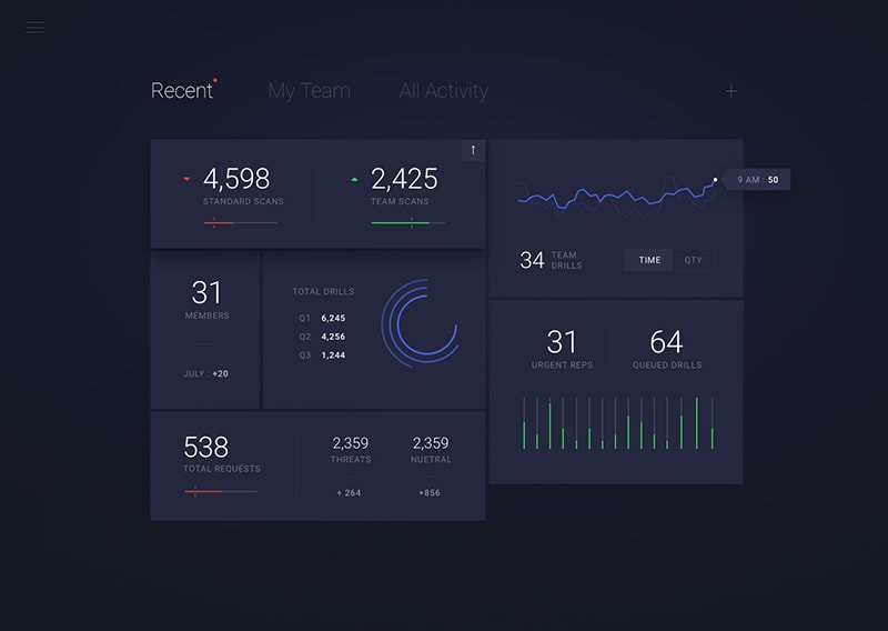
It can be tempting to include extra info on the board, to help the user achieve their goals, but this will have the opposite effect. The dashboard should convey only crucial info, so be ruthless. Not only do you have very little screen space, but too much info will distract the user and make the important stuff harder to find. Take a look at how user-friendly this minimal dashboard is:
In contrast this board features plenty of helpful info, but there’s way too much of it to process:
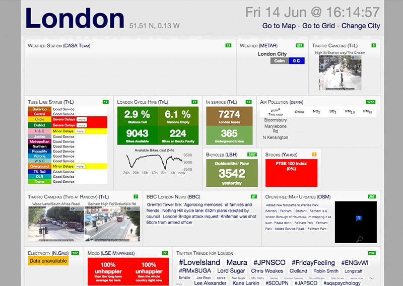
Image from: http://citydashboard.org/london/
Make it easy for users to dive into detail
The user will need to easily navigate from the dashboard to access more detail if there’s a trend that needs their attention. Link each of your dashboard’s elements to a report that shows a granular view of that particular data set.
Google AdWords does this especially well, making a daunting array of reports easy to access from a simple dashboard summary:
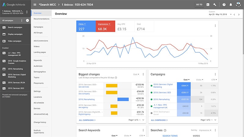
Image from: https://searchenginewatch.com/2018/06/11/using-the-new-google-adwords-dashboard/
Use visuals where possible…
This one’s a no-brainer. Display data in visual form where you can. We’re hardwired to process visual info more easily than text and numbers, and that’s what makes a dashboard so effective.
…But choose the right charts
Some charts only work with certain types of data, so it’s best practice to carefully weigh your options rather than choosing a chart just because it’s used a lot or looks good. The wrong type of chart will at best make info harder to find, and at worst cause the user to misinterpret data.
To help you choose the best chart for your data, here’s a rundown of key charts and their uses:
-
Line charts – are compact and precise. They’re good for showing patterns of change over time. For example, the number of conversions over a 6-month period.
-
Bar charts – are a good way to compare items in the same category. Say, page views by device. To make bar charts user-friendly, sort them by biggest to smallest value rather than randomly.
-
Pie charts – these are very easy to scan but lack precision. They’re hard to read when there are too many components, so use these with caution.
-
Tables – come in handy when you need to compare 2 or more lists of data. They’re less visual (so less easy to interpret) than other elements, but they can be made more-user friendly with contrast and colour.
Take a look at this ecommerce board to see how matching data with the right charts makes the data instantly accessible:
Image from: https://dribbble.com/shots/4021378-Dashboard-eCommerce
Prioritise your layout
Your dashboard needs to be organised in a hierarchy so it’s easy to scan. Best practice is to display the most important info at the top-left of the screen, as this is where the user’s attention is drawn to first.
It can be helpful to make this key info the biggest and boldest too, so users will instinctively know it’s more important. Check out how this marketing dashboard draws attention to the ROI first:
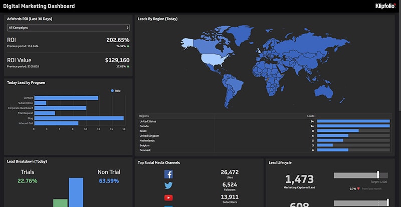
Image from: https://app.klipfolio.com/published/2862ef25c89364092336a154f6e7359e/digital-marketing-dashboard
Most cultures read top to bottom and from left to right, so it’s a good idea to mimic this pattern to create a more intuitive experience for users. Lead with more important info towards the left-hand side of the screen, then work your way across and down.
Group related values together
We’re hardwired to perceive things located next to each other as being in the same category. So grouping related data sets together will make them easier for your user to find and compare. As a bonus, putting related info next to each other will also make the design more attractive.
Give the info context
The user will need to know whether the info on the dashboard indicates good or bad performance. So best practice is to include values the user can compare the current data against. These could be past data from the previous day or week, a projected target, or average highs and lows.
You might want to display a line chart showing how data tracks over a certain period, or indicate context with something as simple as an arrow icon. You can also include warnings if a data set goes above or below a certain threshold.
Facebook’s business insights board is a great example of how comparison values indicate current performance at a glance:
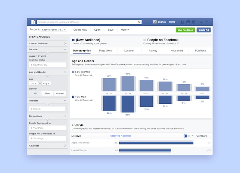
Reference: https://www.facebook.com/business/pages/manage
Guide users with colour
On the subject of context, colours can make or break a dashboard because they play a big role in helping your user interpret data. While your board should share some colours with the rest of the site for consistency, keep in mind dashboards have special requirements when it comes to colour:
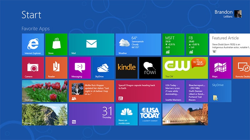
Don’t use too many different colours, especially saturated ones. A riot of colour will distract users from the data and probably give them a headache. An example you might be all-too familiar with is the eyewatering Windows 8 start screen:
Instead, it’s more intuitive to use different shades of the same colour to indicate higher and lower values.
Be consistent with your colours. Use the same colours to indicate features and values in the same category, so users can recognise them more easily.
It’s a good idea to use ‘traffic light’ colours to indicate performance. Everyone knows greens and blues mean good or healthy trends and reds and oranges are areas for improvement. The Fitbit dashboard uses traffic light colours very effectively to indicate a user’s progress:
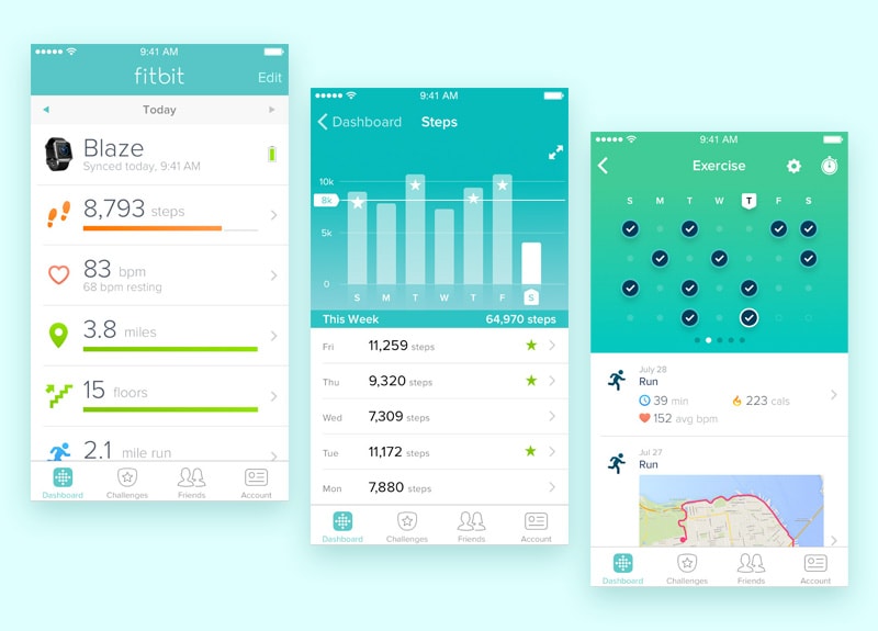
Image from: https://www.fitbit.com/uk/app
Use concise labels
Simple labels will make it clear to the user what each chart is about. Best practice is to choose language your user is familiar with, and to be concise so your labels don’t clutter the board. Abbreviations can be handy too, if they’re not ambiguous. Avoid cramming your dashboard with instructions on how to use it (if the design needs instructions, it needs to go back to the drawing board).
Round your numbers
Because your dashboard is basically a summary of overall trends, it’s a good idea to save a high level of precision for the in-depth reports. Using data that’s accurate to 3 decimal points actually reduces clarity and means it will be open to misinterpretation. Best practice is to keep things simple, and round figures up or down.
How to design dashboards for mobile
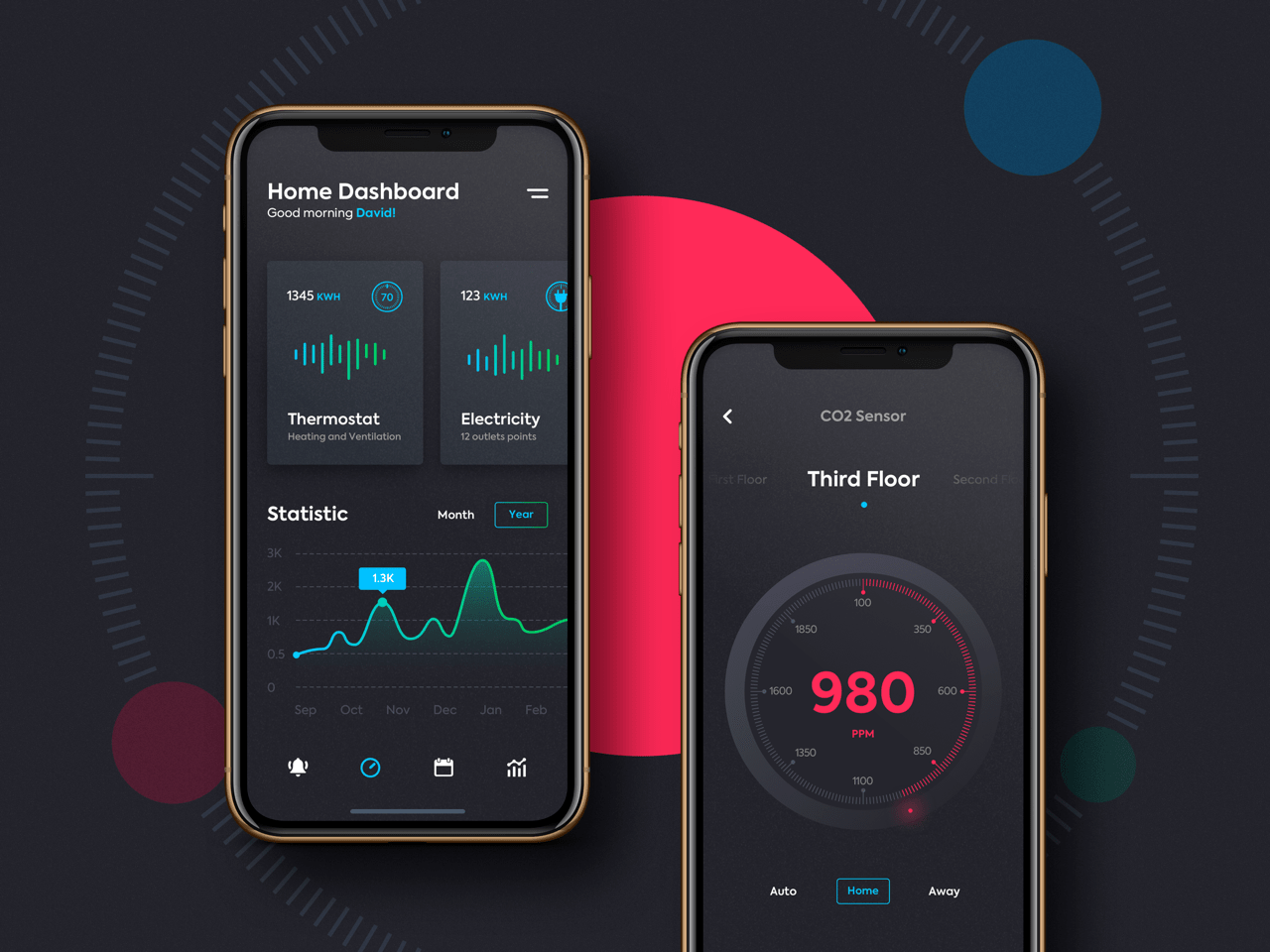
Image from: https://dribbble.com/shots/6219702-Remote-Home-Control
Alongside the rising trend for dashboards on mobile apps, businesses are increasingly relying on mobile as a convenient way to get insights onsite and away from the office. So great dashboard design these days often involves being mobile friendly, too.
Basically, the same rules apply when creating boards for mobile and tablet as for desktop, but they’re even more important. Because a smaller screen means you have less real estate to display info, it’s essential the layout is streamlined, clean and minimal. You’ll need to provide only the bare bones – the essential data your user can’t do without.
But, there are some other factors you’ll want to keep in mind if you’re designing a dashboard for mobile:
Business intelligence dashboards tend to be more operations focussed
If you’re designing a mobile business intelligence dashboard, take into account that because users will be checking their phone on the go, they’re more likely to need data focussed on daily operations rather than analysis.
For example, a field or site manager will need data they can spot instantly and act on straightaway. If this is the case, make sure there’s no irrelevant analytical data cluttering your screen.
Design for touchscreen – aka ‘fat finger’
There’s nothing more frustrating than tapping on an element and being taken to the wrong page, and this is especially true of dashboards. Make sure there’s enough spacing between links and visual elements so the user won’t accidentally select the wrong one.
Be consistent
It’s important to be consistent throughout the website or app, so the user can focus on tasks without being confused by a new look. So best practice is to keep your board’s layout, colours and elements as similar as possible to other pages.
Use contrast
And finally, a design for a small screen needs to be visually appealing and draw attention to key elements. Best practice is to contrast background and foreground colours, say using a dark background with light colours as elements in the foreground so they stand out. Check out how this board for a smart home controller uses a high-contrast palette to make info easy to spot:
And there you have our complete guide to dashboard design, from the different types of dashboard to the best practices for creating a great board on desktop and mobile devices. I hope you’ve found this guide useful for your future projects. Have you any tips for creating an effective dashboard? Let us know. We’re always keen to hear about great design practices.