I’m assuming you’ve heard of UX design. If you haven’t, have no fear, we have a blog for that. Check it out here. Let’s look at an important area of UX design, UX for mobile. Just 10 years ago, this part of UX design would be a complete after thought. But, as the majority of people now having smartphones, mobile website and app design and has become a priority. The next 8 sections will answer all your questions about Mobile UX design.
1. How do people interact with your website?
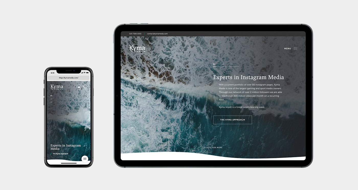
Maybe one of the biggest misconceptions about websites today is that most people still hop on their laptop to learn more about your business. However, in 2019 that just isn’t true. 85% of people in the UK have smartphones. When you take a step back and consider that smartphones usage will only increase, this fact makes a lot of sense. Smartphones have changed the way we do product and service research. It’s as easy as pulling your phone out of your pocket, asking Siri a question and within seconds they’ve landed on your site.
You need to make sure your site is working perfectly to keep them interested. This isn’t a nice to have any more either. Google looks at your mobile site performance and ranks you based on how well it works. This is exactly where UX mobile design comes in, taking the time to optimize your site will only benefit you in the long run. Desktop and mobile experiences are very different, which leads nicely to the next several section of the article.
2. What makes mobile different to other platforms?
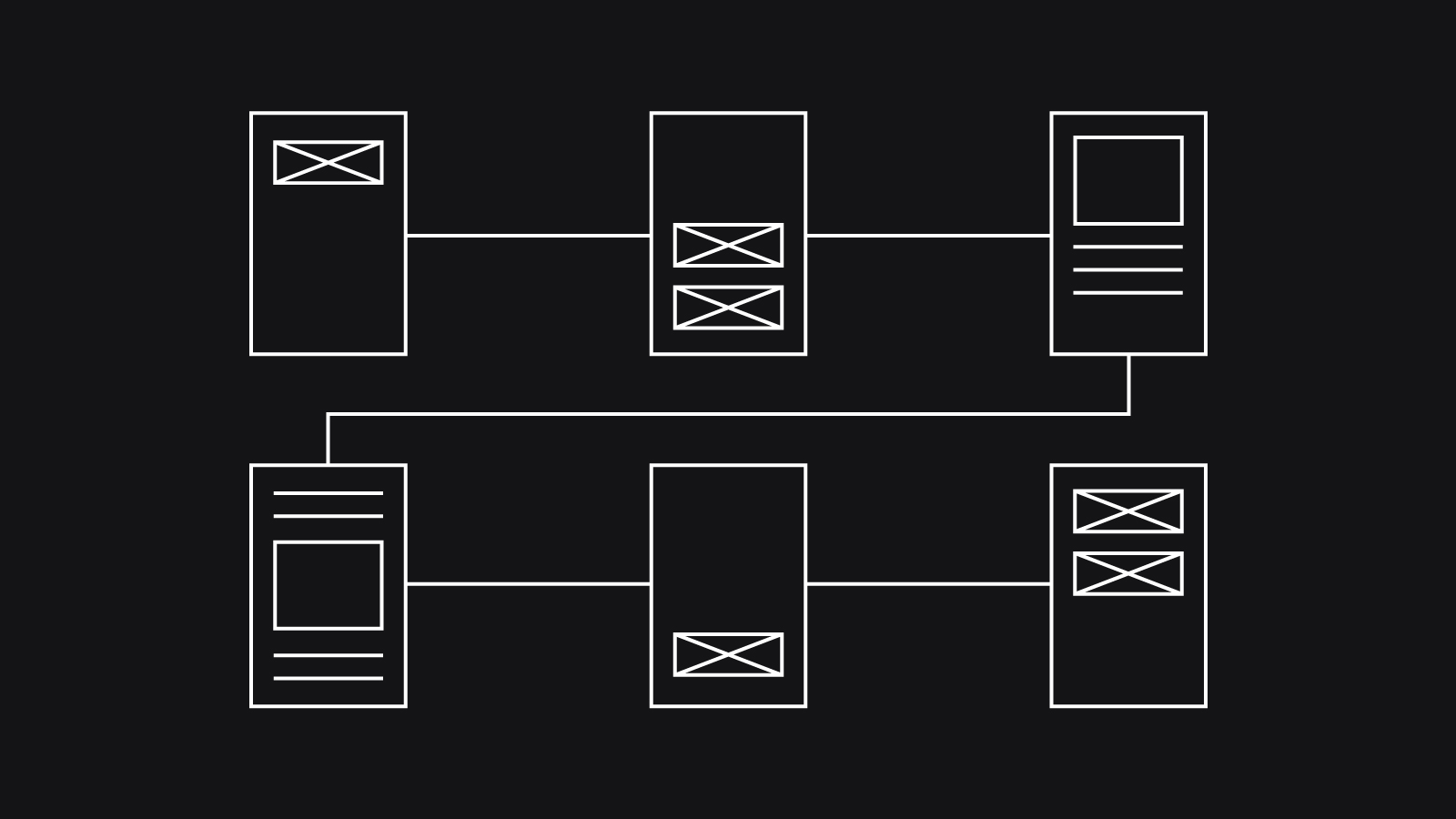
The main platforms to consider when developing your website are Desktop, Tablet, and Mobile. The biggest difference between desktop and tablet/mobile is the size and the way you use the website. With these in mind the design of a website might be very similar or very different. Regardless, the look and feel has to be seamless across all platforms. One platform to keep in mind for the future is wearables. As smartwatches continue to improve and become more popular, it could become an important format to consider.
I know I personally have my phone in my hand or within arm’s reach most of the day. We are constantly searching, exploring, and scouring the web for answers. This is something not applicable to desktop and tablets. Unless you are already using your computer or have your tablet in your hand, you are reaching for your phone first every time. The immediacy of the mobile platform is, in my opinion, priority. People that visit your site want answers fast and if your UX mobile design doesn’t offer quick and simple navigation, they will go somewhere else.
3. How do users interact with websites on mobile?
Tapping, swiping, gesture, pinching, scrolling, and more. The act of using a website on desktop is very different. Mouse vs. finger gestures. If your mobile site is built like a desktop site, your user is not going to get very far. Smartphones have come along way and app interfaces are improving every day. Users’ expectation of mobile experience will only continue to increase. It is important to keep this in mind.
4. What should I consider to improve my mobile UX design?
Here are some points to keep in mind to improve your mobile UX design.
1. Keep it Simple
“Rule of thumb for UX: More options, more problems” – Scott Belsky, Chief Product Officer. There is nothing wrong with an app that is simply easy to use. People appreciate things that they don’t have to constantly try to figure out.
2. Show progress or loading animations.
It can be frustrating waiting for an app or website to load. It’s even more frustrating when you can’t tell if anything is happening. Adding a reference skeleton has been proven to be perceived as a shorter wait time as opposed to a spinner, loading bar or leaving it blank.
3. Make sure you’re consistent
With a consistent look and feel, your website becomes whole. Having pages that don’t match the general website will look unprofessional and could potentially confuse the user. Heading sizes, font, colour, spacing and more should all match and be consistent throughout your whole design.
4. Test!
This is another common-sense tip, but absolutely an important one. UX Design is about making a product, in this case website or app, useable for the consumer. If you create your design without trying to use it or observing how others use it, you could end up with something completely unusable. Always take a step back and ask your friends or family to give it a try. You’ll almost always find things to improve.
Reference:https://xd.adobe.com/ideas/principles/app-design/10-dos-donts-mobile-app-design/
5. What’s a sign of poor mobile UX?
As there are actions to take to improve mobile UX, there are always things to avoid that lead to poor mobile UX design.
1. Avoid replicating the desktop experience.
Desktop and mobile are very different and should be designed to complement, not replicate, each other. Some things won’t work on mobile, making it more difficult for the user, which is exactly the opposite of what you want. One example of this is sticking with a traditional menu. Linear top menus should be kept on desktop.
2. Pages that don’t work
Another no brainer, but check, double check and then check again that there are no dead links on your site/app. If a user ends up on a page that doesn’t exist or doesn’t work, that is directly going to affect the user flow, not a good look.
3. Non-Responsive design
There are thousands of different devices these days. If your website or app doesn’t resize to accommodate you are behind the times. Responsive design was first championed by a designer called Ethan Marcotte. He emphasised the important of having a design that fluidly adjusted to different sized devices. This was back in 2010, in 2019 this is essential.
6. What’s a sign of good mobile UX?
1. Load speed
WIFI, 3G, and 4G will all load different things at different speeds. The test will be if you take that into account and optimize your site to run its best across varying speeds.
2. Mobile minded design
This ranges across many different small aspects that help play into the big picture. Some examples would be having a call button instead of a phone number, which makes sense because you’re viewing it on a mobile device already. Another small detail would be the amount of text chunked together. It is not always the case, but you can assume people are less likely to sit and read huge amounts of text. This insight will help you rethink how to convey your messaging on mobile.
3. Appropriate font size
A small detail that might get overlooked, but if your text is too small, it can be an enormous problem for the user. Screens on phones are much bigger than they used to be, but they are still quite small. Less text and slightly larger font could make all the difference.
7. What’s an example of a company providing good mobile UX design?
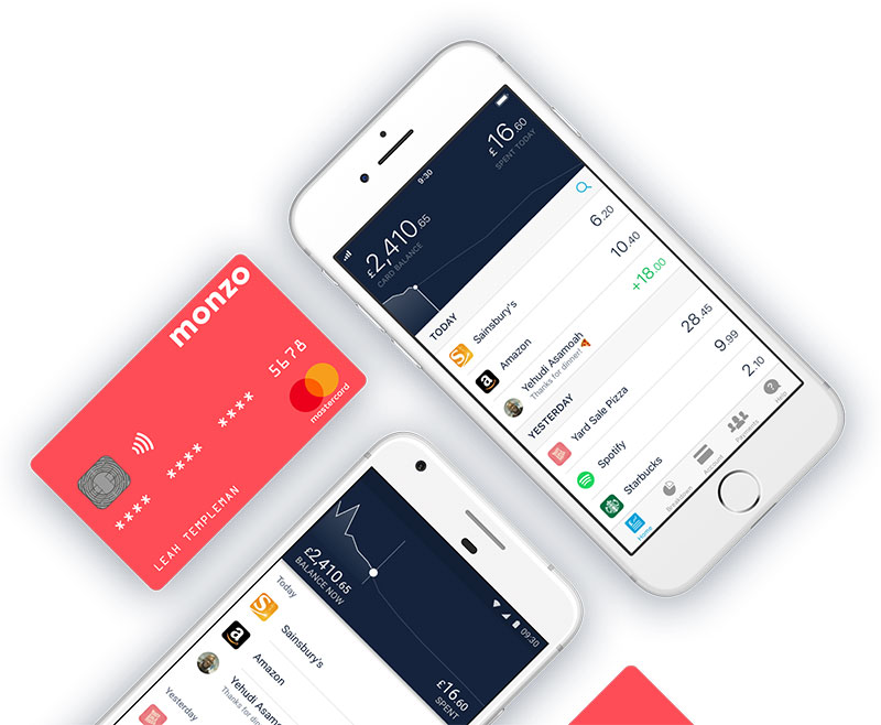
An app with great Mobile UX design is Monzo. Monzo goes against the traditional banking model by being one of the very first mobile only bank organizations. Created back in 2015, Monzo set out to shake up the industry and simultaneously became an amazing example of the importance of UX design on mobile.
The reason Monzo is so good is simply because it works as you would expect it would (even if you’ve never used a mobile bank before). The team at Monzo took everything you might expect walking into a brick and mortar bank, and provided it in a mobile app seamlessly. This is a huge key difference versus other bank apps today. From the first time you load the app you can see they took the user into consideration first, as opposed to other bank apps that seemed to be retrofitted for a phone.
A few things Monzo does incredibly well:
1. Elegant and quick notifications.
Something you might never knew you needed, getting a notification when you pay with your phone or card. This not only adds a level of security, but this also allows you to self-categorize purchases for smarter spending.
2. Spending money abroad.
Considering how many different currencies there are in Europe, this is a no brainer. Monzo includes currency calculation within the app, so you can keep track of exactly how many pounds you’re spending in any country.
3. Intuitive options.
Whether it’s freezing your card, transferring money, splitting a bill, or cancelling a card, everything is built into the app. As mentioned before, Monzo made a conscious effort to take anything and everything a traditional bank has to offer and created a seamless app experience. This frees the user to focus on the task.
4. It’s just plain beautiful.
This one is all about the aesthetics of the app itself. There are a lot of technical aspects to consider with UX design, but it certainly helps for your design to look good. Stick to your brand colours as Monzo does, but don’t be afraid to push the envelope.
8. What are the latest trends in mobile UX?
My top 5 Mobile UX trends…
1. Gestures paired with animation
The addition of a simple animation can really improve the user experience. Seeing a micro interaction can be rewarding for users and ensures they understand that their interaction has registered.
Reference: https://uxplanet.org/12-mobile-ux-design-trends-for-2018-5b4ce7e8445f
2. Improvement to mobile devices
This might not seem like a trend per say but this fact alone gives you more freedom to express your creativity for mobile. Having the confidence that more browsers can load your content quicker, or the device can handle more complex animations gives your designers freedom to add more animations, transitions and more.
3. Vibrant and Bold Colours
Let your company colours fly. Having a variety of colours represented on your site or app is a great way to show off some personality. Using different colours to signal transitions, and animations can really help make your design look dynamic and fresh.
Reference: https://uxplanet.org/15-hot-trends-in-ui-design-for-web-and-mobile-in-2018-eff86df6d868
4. Increase in video
This is a trend that can be seen across the Internet. It is estimated that by 2021, 80% of the world’s internet traffic will be video. If you want to incorporate video into your design, remember to consider orientation, loading times and the different formats such as square or portrait video.
5. Mobile led innovations
Until this point, most UX trends and changes have trickled down to mobile. As mobile use continues to grow and surpass desktop, apps and mobile webpages will begin to lead the trends that we’ll be talking about in as little as a year’s time.
UX design can be an overwhelming topic to wrap your head around, but when you take a second to breakdown what it means, it becomes a much more manageable project to undertake. You want the best experience for your user. Mobile isn’t going anywhere anytime soon, so there’s no time like the present to improve your UX design.