Web design trends are continuously evolving. Being able to implement and adapt alongside them is an important skill for designers to hold. Successful designers don’t simply ignore these trends, they research, adapt and understand them to strengthen their work.
Current trends exist for a reason. Whether it’s enhancing digital relatability via BeReal, the adoption of technologies such as augmented reality or simply having a Negroni Sbagliato with Prosecco in it.
It is really up to you as a designer if you decide to follow emerging design trends and use them as inspiration. However we believe it is important that you understand what is influencing and contributing to current artistic movements.
With these creative influences continually happening, let’s take a look at what trends we think you should keep an eye on in 2023.
1. Glassmorphism
We can expect to see a light touch of frost influencing web design trends in 2023, bringing in slightly cooler colour palettes and nods to glassmorphism.
While the concept of glassmorphism itself isn’t new, the idea of bringing dimensionality to web design will hold significance this year. With Michal Malewicz coining the term in 2020, glassmorphism adds a sense of depth and texture to web designs, creating beautifully crafted blur effects with added transparency. These pixels enhance the almost opaque quality of frosted glass – perfect for designs with multiple layers.
Frosted glass icons are expected to be the hottest trend within glassmorphism in 2023. With many icons being small in size, incorporating this frosted glass effect can build upon the visual complexity within a design.
However, a significant accessibility concern includes users who are visually impaired. To ensure maximum accessibility, implementing larger fonts can enhance these glass-like designs but also ensure they can be accurately interpreted by screen readers and other assisted devices.
![]()
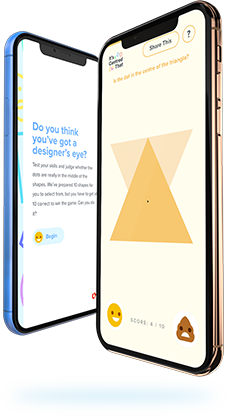
2. Expressive type
Typography has long been a form of expression in design, we’ve recently been seeing designers pushing the boundaries in legibility and scale in digital design, many opting to use type as a brand asset over imagery. This has created some interesting and unique experiences for users, and something we could see a lot more of….
All fonts aside, typography on the web just keeps getting larger and larger. It’s no longer just exaggerated text in the hero area anymore, we are witnessing bigger type choices inside every other module within a website’s design.
The typographic scale is used to create a balance between font sizing, ensuring it’s scalable and adaptive. With a variety of scales, these help establish a clear hierarchy within a website’s copy both on mobile and desktop.
The result? Perhaps a more readable user interface. With the rise of Tik Tok and Youtube Shorts, it’s clear within this digital age that our attention spans as users have shortened, and shorter attention spans demand larger fonts. It’s suggested that ‘words presented in larger font size are considered more memorable’ and allow us to read faster through tactical website design and engaging copy.
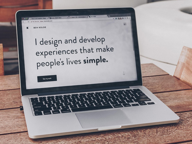
You’ll notice across digital designer Thibaud Allie’s site his use of an overstated typeface which fills the full viewport width. Although this is very much in-your-face, his choice of a sleek simplistic type doesn’t overwhelm and overpower us as users. Instead, he allows his text to become a feature, enhancing his key points to maintain users focus and attention.
3. AI generated art
Whenever new technologies start to influence the world of design, you can sense the concerns which begin to shower the design community.
The increasingly popular use of DALL-E and Midjourney within web design is becoming increasingly popular, with more people starting to experiment with AI created visuals. These artificial intelligence systems ease the creation of ‘realistic images and art from a description in natural language’. DALL-E for example, has been heavily influential since it was first introduced back in April with many considering it the most advanced AI art generator yet.
A great example of this is by Cosmopolitan magazine who created the world’s first AI-generated magazine cover using DALL-E 2, paving the way in this new era of “generative AI”.
It’s still too early to tell whether this new era will end up costing artists and illustrators their jobs, however with digital artists heavily focused on being recognised online, the rise of AI generative art could impact the creative industry in a significant way. Designers are first and foremost creative, and this will always be necessary. However, they must embrace these new technologies and be clever with their use, allowing them to ‘stretch the boundaries of what seemed impossible’.
Because these text-to-image AI tools are still within their infancy, they are continuing to expand and develop fast. We can therefore expect to see more AI generated imagery being incorporated into digital design moving into 2023.
4. Parallax scrolling
Parallax scrolling websites continue to be a popular forecasted web design trend, with Nike Better World being one of the first sites to incorporate this scrolling effect way back in 2011. Prior, it was suggested that websites include as much information above the page fold to prevent the user scrolling, however parallax scrolling introduced a sleeker way of engaging users as they scroll.
This technique is effective as it adapts the background of an interface layout to move at a varying speed than the foreground as the user scrolls, establishing an almost 3D effect.
With 94% of first impressions on a website influenced by visuals, parallax scroll’s interactive nature successfully engages users from the outset through interactivity. The variety of layers and speeds effectively establishes depth across the multiple overlays.
A great example of this is from Hung incorporated with his use of exaggerated typography, contrasting colour palette and bold use of imagery. This successfully enhances a sense of an optical illusion, creating a more immersive browsing experience.
For our client Proof Drinks, they asked us to bring their brand Cazcabel to life by combining video, sound, textures and typography. By using parallax, we used these elements to create an interactive website with unique animations via the panoramic backdrop.
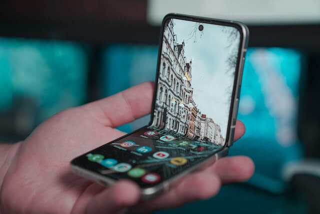
5. Design for Foldable
Now if you’re an Apple user, hear us out!
With 2023 anticipated to be the year of foldable devices, designing for these devices may become as iconic as Nokia’s ‘Brick Phone’ back in the 2000s.
For these adaptive folded/unfolded postures such as the Galaxy Z Fold 4, it’s important to consider and limit the amount of interactions which are located within the upper 25% of the viewport as this is likely to be out of reach for users.
Another key design consideration for these folded states is how the user operates. We can expect that folded states will be navigated using one hand, however the unfolded state will require two. This highlights the importance of positioning UI and UX elements within the thumb and other finger’s area.
6. Cursor Effects
When we discuss current design trends, the manipulation of a user’s cursor is an absolute winner in 2023.
The rise of hover and cursor animations allows sites to add personality and fun to a user’s experience. These dynamic movements are effective in capturing a users attention particularly in e-commerce sites as they can successfully engage them well enough to enhance conversions.
Creating unique cursors is also beneficial as whilst keeping users entertained and engaged, it’s simultaneously giving site’s enough time to load your data smoothly. A great hover effect can also help showcase more information in the most simplistic way possible. Key inspiration such as Quadrangle effectively convey their team’s personality and culture via switching more relaxed imagery on hover – creating an almost parasocial relationship through familiarity and approachability.
Similarly, Thoughtlab has incorporated the use of organic shapes (which were considered a key trend for 2022) with site interaction by allowing the asset to follow the users cursor movement across the site’s hero module. This successfully makes the cursor seem more prominent and establishes user interaction from the outset. As we move around the content-rich site, the organic shape later becomes a background asset the further we scroll, allowing users to fully interact with the content.
We really enjoyed incorporating this into GamiFi’s hero area on one pager, utilising their 3D assets and cursor movement to retain the playful feel that is important to gamers of any generation.
Overall, using cursor effects provide an opportunity to wow your visitors who are anticipating the default mouse pointer – and who doesn’t want a WOW!
Do you think we’ve missed any trends which could dominate or even drop off the map in 2023? Let us know by tweeting us at @supremohq