Colour is a fundamental element in brand identity design that wields immense influence over consumer perception and emotion. When strategically applied, it has the potential to evoke specific feelings, establish brand recognition and convey a brand’s personality. Understanding the principles of colour theory can be a game-changer for businesses seeking to leave a lasting impression in the minds of their target audience.
Colours have a profound impact on human psychology, and each hue evokes distinct emotions and associations. Let’s take a look at some colour theories and the brands that adopted the colour.
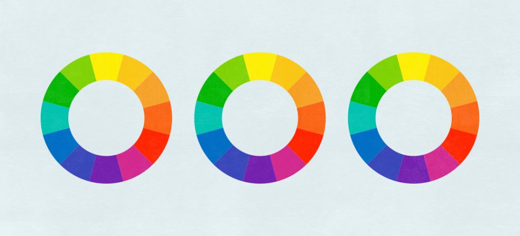
Colour Psychology & Brand Examples
Red – Represents passion, energy, and urgency. It often elicits strong emotions and can stimulate appetite and excitement.

It’s also used by Charities to denote urgency, signify importance & command attention – British Heart Foundation, Shelter, Save the Children
Orange – Represents energy, warmth, enthusiasm, and creativity, evoking feelings of vitality and positivity.

Yellow – Radiates optimism, happiness, and creativity. It’s a vibrant choice that grabs attention and stimulates the mind.

Blue – Conveys trust, calmness, and reliability. It’s a popular choice for established and professional brands.

Green – Symbolises nature, growth, and harmony. It’s associated with health, wellness, and eco-friendliness.

Pink – is associated with affection, tenderness, and nurturing, often conveying feelings of love, compassion, and playfulness.

Purple – Signifies luxury, creativity, and sophistication. It’s often used to appeal to a more artistic or imaginative audience.

Brown – signifies stability, reliability, and earthiness, often evoking a sense of warmth, comfort, and groundedness.

Black – Represents sophistication, elegance, and authority. It’s commonly used by luxury brands seeking to convey exclusivity.

Multi Coloured – or rainbow hues symbolise diversity, inclusivity, and a dynamic range of emotions or ideas, often representing a vibrant and eclectic spectrum of possibilities.

Why is colour important in Branding?

1. Establishing Brand Personality
Selecting the right colours for your brand is crucial to defining its personality. Consider the traits you want your brand to exude and choose colours that align with them. Are you aiming for a fun and energetic brand (think bright and vibrant colours like reds and yellows), or do you want to convey a sense of trust and reliability (opt for blues and greens)? The chosen palette should reflect the essence of your brand’s identity.
2. Creating Visual Consistency
Consistency is key in branding, and colours play a pivotal role in creating a cohesive visual identity. Establish a primary colour palette that will be the cornerstone of your brand’s visual elements, such as logos, websites, packaging, and marketing materials. Complementary and secondary colours can be used to accentuate and highlight specific aspects.
3. Understanding Cultural and Regional Significance
Colours can carry different meanings in various cultures and regions. For example, while white is associated with purity and weddings in Western cultures, it’s a colour of mourning in some Asian cultures. Therefore, it’s crucial to conduct thorough research if your brand intends to expand its reach globally.
Conclusion
Incorporating colour theory into your brand’s visual identity can be a powerful tool in establishing a strong and memorable presence in the market. By understanding the psychology behind colours, aligning them with your brand’s personality, maintaining visual consistency, and considering cultural nuances, you can create a brand identity that speaks directly to your target audience and leaves a lasting impression. Remember, colours are not just a visual element; they’re a powerful language that your brand uses to communicate with the world.
Need help with your branding? Get in touch today and start your journey to brand enlightenment.