A rebrand and a brand refresh are two distinct strategies for updating a brand’s visual identity, messaging, and overall image. The key difference between the two lies in the scope and scale of the changes made. Let’s take a closer look…
A rebrand involves a complete overhaul of a brand’s identity, this could include changes to its name, logo, tagline, messaging, and brand architecture. Rebranding is usually done to signal a major shift in the company’s mission, values, or target audience. A rebranding effort is typically a significant undertaking that requires a lot of time, effort, and resources.
A brand refresh is a less drastic approach that usually involves updating and modernising a brand’s visual identity, messaging, or positioning. A brand refresh can include changes to the logo, colour palette, typography, and other visual elements. It can also involve updating the brand’s messaging to better resonate with its target audience or to better reflect the company’s current values or offerings.
Overall, the main difference between a rebrand and a brand refresh is the extent of the changes made. A rebrand involves a more comprehensive overhaul of a brand’s identity, while a brand refresh is a more incremental update that aims to improve and modernise the brand without completely changing its core identity.
What are the benefits of rebranding?
Rebranding can have a number of benefits for a company, these include:
- Increased relevance – Rebranding can help a company stay relevant and up-to-date in a fast-changing marketplace.
- Improved brand perception – A rebrand can help improve a company’s brand perception by updating outdated or negative associations.
- Enhanced differentiation – Rebranding can help a company stand out from its competitors by creating a unique and distinctive brand identity.
- Stronger customer loyalty – A rebrand can help reinforce a company’s connection with its existing customers by refreshing its image and reminding customers of the brand’s value proposition.
- Increased revenue and market share – By improving its brand image and appeal to customers, a company can potentially increase revenue and market share.
What are the benefits of a brand refresh?
A brand refresh offers the same benefits as a rebrand with a few bonus ones including:
- Improved consistency – A brand refresh can help ensure that a company’s visual identity and messaging are consistent across all channels and touch points.
- Cost-effective – A brand refresh is typically less expensive and time-consuming than a complete rebranding effort, making it a more cost-effective way to update a brand’s image and messaging.
Can you spot the difference?
Let’s play a game. Can you spot the difference between a rebrand and brand refresh? Below are some iconic examples of both.
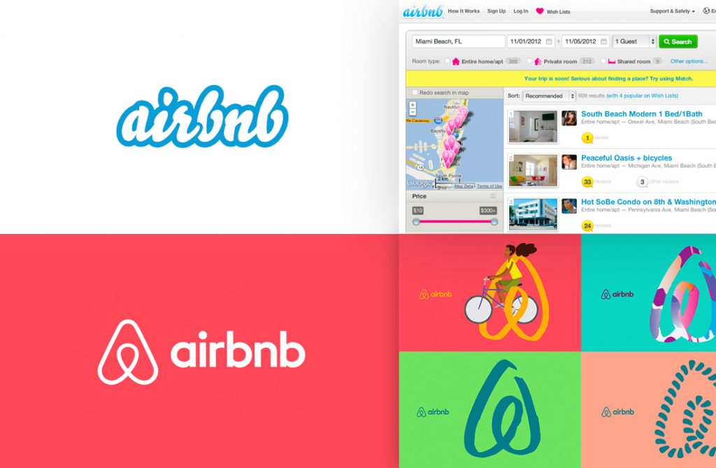
Airbnb: In 2014, Airbnb released a new logo, website design, and overall brand identity. The new branding was designed to be more cohesive and reflective of the company’s global reach and community-focused mission.
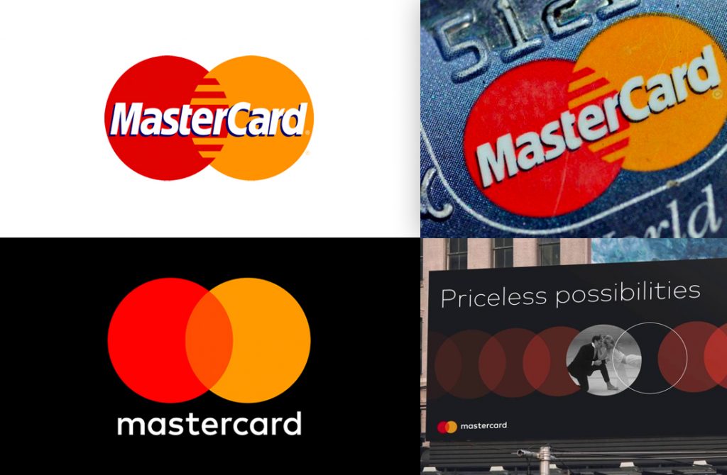
Mastercard: In 2016, Mastercard updated its logo and visual identity, with the new branding featuring a simplified, modernised version of the company’s iconic interlocking circles. This was intended to make the brand more relevant and adaptable to digital platforms and mobile devices.
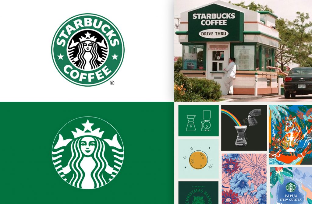
Starbucks: In 2011, Starbucks revealed a new logo and tweaked visual identity. The new logo removed the company’s name from the design, leaving only the iconic siren, a more streamlined and modern version of the original design.
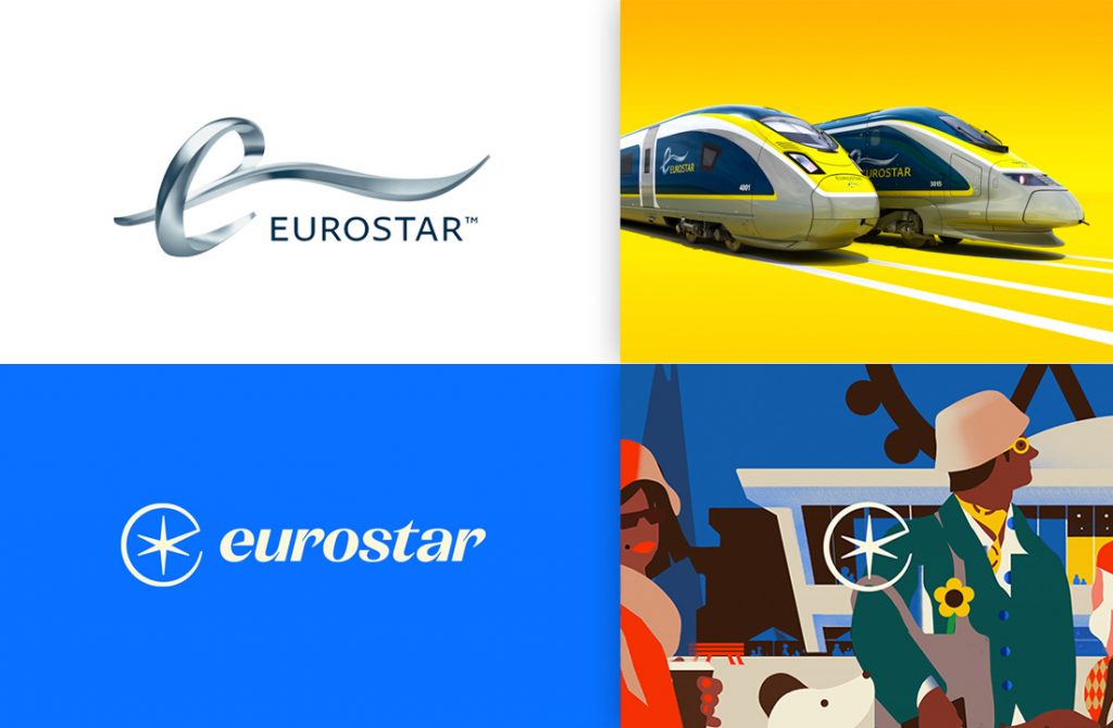
Eurostar: In 2023 Eurostar launched a new bespoke wordmark, icon and graphic spark device that harks back to the original 1994 version. A new colourway has been introduced along with new photography. Illustration work has been commissioned to capture the unique feeling and energy of each destination.
Answers:
AirBnB: Rebrand
Mastercard: Refresh
Starbucks: Refresh
Eurostar: Rebrand.
Don’t throw the brand out with the bathwater
When deciding whether to undertake a brand refresh or a rebrand, it’s important to take care not to ‘throw the brand out with the bathwater’. If you need a complete overhaul to enter a new market or you want to leave behind negative perceptions then you may well need to throw out your old brand and move on. The risk however, is that a brand takes time to build. You don’t want to lose a heritage that resonates with your audience, diminish the brand recognition or pursue identity trends that dilute your brand (blanding).
Definition:
Blanding is a term used to describe the process by which a brand loses its distinctiveness and becomes generic or unremarkable. Blanding can occur when a company tries to appeal to too broad of an audience or when it fails to maintain consistency in its messaging and visual identity.
Here’s two brand examples of rebrands that went wrong. Both brands fell victim to blanding and had to revert back to older versions of their brand identity in order to salvage the brand:
Burberry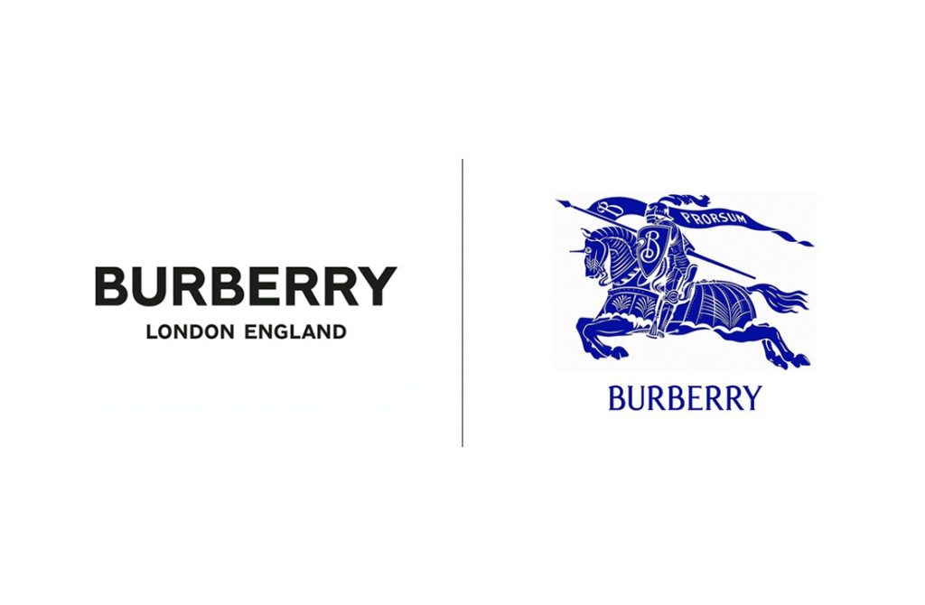
Burberry revealed its new branding on February 6 this year in an effort to revert towards a visual identity that draws upon the brand’s heritage. The previous branding had featured a minimal brand identity paired with a sans serif wordmark; a trend that had been snowballing its way through the fashion industry. This trend could be in response to creating brands that are well suited to digital viewing as opposed to print and traditional media but ultimately the result was a generic aesthetic that lost the heritage of the brand. The new logo is a reworking of Burberry’s original symbol, known as the Equestrian Knight Design, which was adopted by the house after it won an open design competition circa 1901. In reverting the direction of the brand Burberry has been able to celebrate its legacy and save itself from the clutches of blanding.
Gap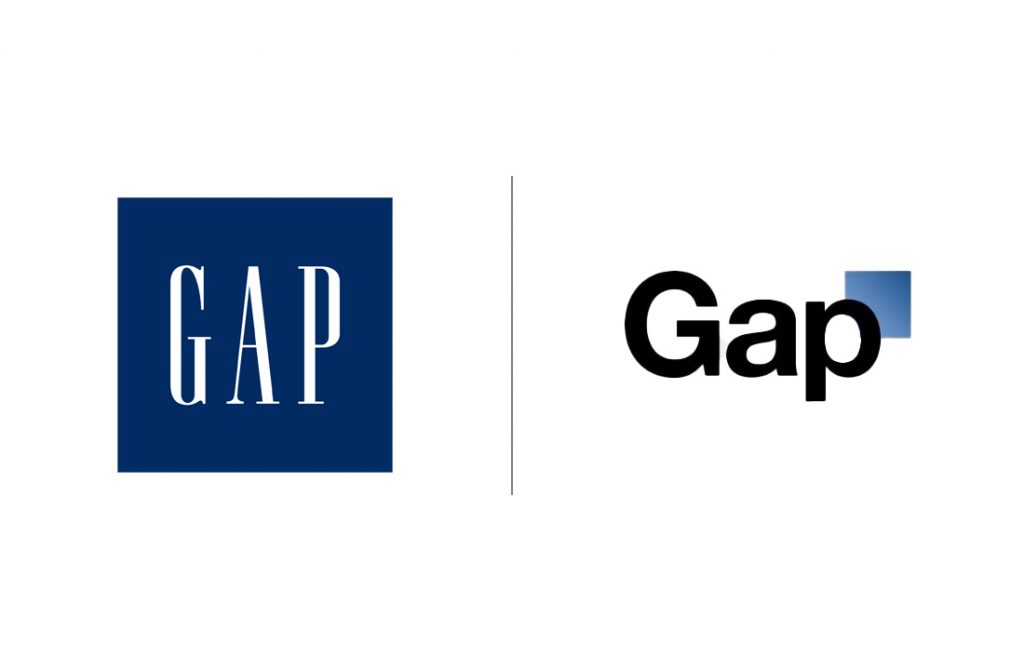
Another cautionary tale for companies considering a rebranding effort comes from the American clothing retailer, Gap. Back in 2010 the retailer attempted a rebranding campaign that turned out to be a significant failure. They too replaced an iconic logo with an uninspired black sans-serif font. The rebranding campaign was met with backlash from customers, who took to social media to express their disappointment and frustration with the new logo. In response, Gap quickly abandoned the new logo and reverted back to its classic blue box logo. This failed rebranding campaign is an example of the importance of careful brand strategy and execution.
Conclusion
Whilst it is important for companies to stay current and relevant, it is equally important to maintain consistency and respect for your brand’s heritage and existing identity. There are many benefits to carrying out a rebrand or brand refresh but getting support and guidance from a branding agency can help you to navigate the complexities of this process and make sure you reap the rewards.
Need help with your branding? Get in touch today and start your journey to brand enlightenment.