Alex Clapperton is a graduate web developer and has finished a successful 4 month placement at Supremo. See his portfolio at alexclapperton.co.uk

Over the last few years, the web has evolved at an astonishing pace and shows no signs of slowing down. So much so, that webpage layouts are becoming more and more complex for web developers to create. So far, we have been relying on hacky solutions like floats to create our layouts. More recently developers have been using Flexbox which goes some way to creating complex layouts easier but by no means is it the perfect solution. However, an exciting new layout module known as CSS Grid has now surfaced and is without a doubt the ultimate solution to all our layout problems.
What is CSS Grid?
I’m glad you asked. The core behind the Grid layout module is to divide a web page into columns and rows with the ability to size and position block elements based on the number of rows and columns we create. Grid also allows us to easily change positions of block elements based on different screen sizes. All of this is done solely with CSS and does not require any altering of our HTML.
Browser support
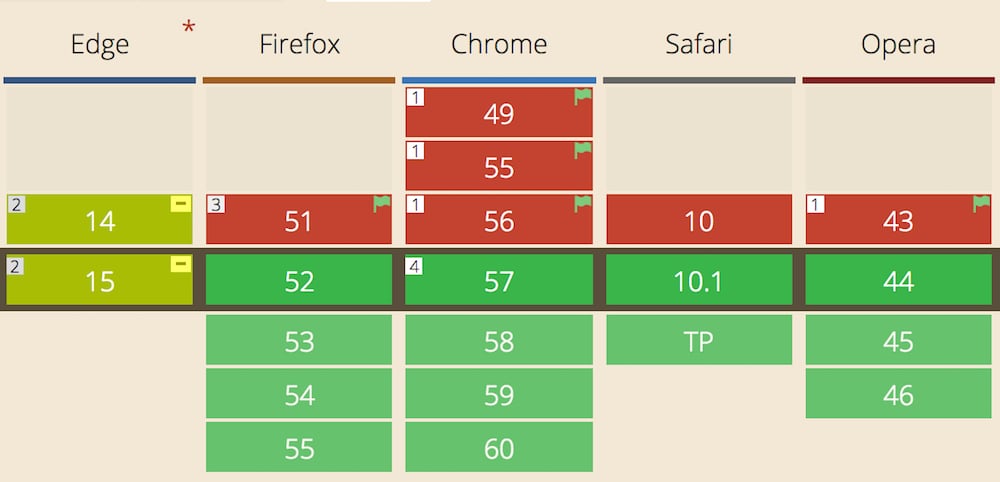
Before we rush off and start using Grid, it’s important to understand the status of browser support for Grid. The awesome news is that Chrome, Safari, Firefox and Opera all have Grid enabled by default on their latest versions. Edge on the other hand, has recently announced that Grid is in development. Internet Explorer 10 and 11 support and old implementation of Grid.
An example of using Grid
To see the power of Grid in all its glory, let’s have a look at when we put it to use.
Let’s imagine that we want to create a 3-column layout consisting of a header, banner, content, sidebar and footer.
Here is our HTML:
<div class="grid">
  <header class="header">HEADER</header>
  <section class="banner">BANNER</section>
  <article class="content">CONTENT</article>
  <aside class="sidebar">SIDEBAR</aside>
  <footer class="footer">FOOTER</footer>
</div>
Now we apply our CSS to the .grid container:
.grid {
  width: 80%;
  margin: 0 auto;
  display:  grid;
  grid-gap: 20px 30px;
  grid-template-areas:
    "header header header"
    "banner banner banner"
    "content content sidebar"
    "footer footer footer";
}
Then some CSS to our grid items (Yes I’m using Sass here):
.grid__item {
  background-color: #eee;

  &--header {
    grid-area: header;
    padding: 20px;
  }

  &--banner {
    grid-area: banner;
    padding: 60px 20px;
  }

  &--content {
    grid-area: content;
    padding: 100px 20px;
  }

  &--sidebar {
    grid-area: sidebar;
    padding: 100px 20px;
  }

  &--footer {
    grid-area: footer;
    padding: 20px;
  }
}
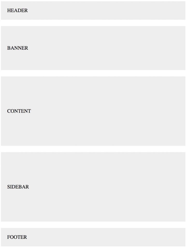
Which should create something like this:
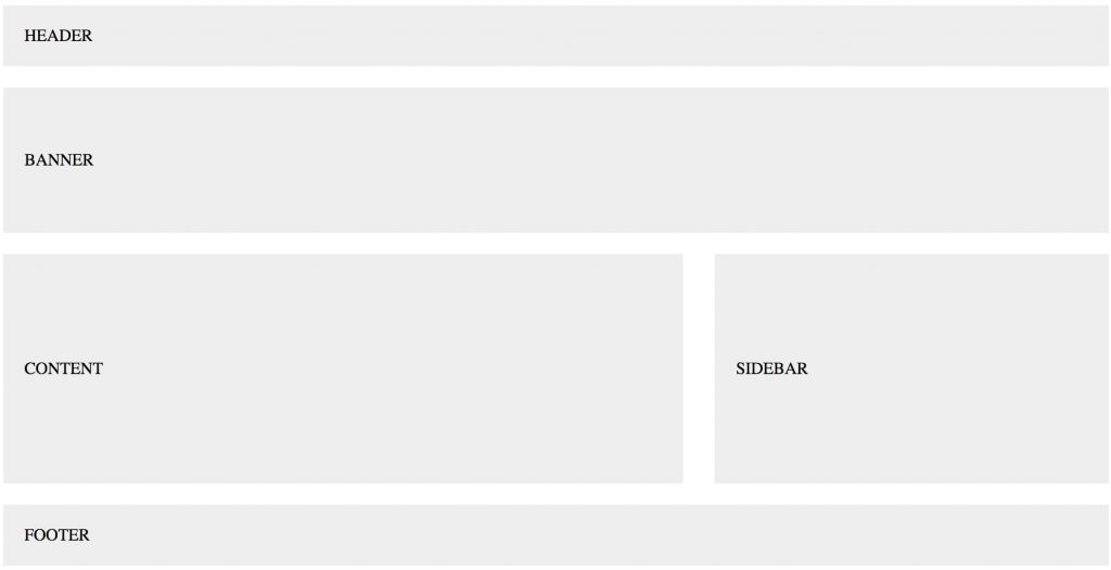
You can view the full demo of this on CodePen.
Let’s explain a little about what we’ve done to achieve this layout:
- Set the display property of the .grid container to grid.
- Set the spacing between the rows 20px and the columns 30px using grid-gap.
- Defining our grid layout with named areas using grid-template-areas.
- Assigning our grid items to their corresponding area name using grid-area.
As you can see, the Grid layout module adds a new value to the display property which is grid. This value is required to start using Grid. One property that stands out is grid-template-areas which allows us to assign names to our grid items and define how many columns and rows we want all in one property. I could have also used grid-template-rows and grid-template-columns to define the grid. Assigning names to grid items will hopefully make it easier for any developers who collaborate with designers.
To make this grid responsive, we only need to change our grid-template-areas property in our media queries like so:
@media (max-width: 768px) {
  .grid {
    grid-template-areas:
    "header"
    "banner"
    "content"
    "sidebar"
    "footer";
  }
}
This puts every grid item underneath each other in one column. Simple.
Grid vs Flexbox
Since many of us like to use Flexbox, you might be wondering: Is there any point in using Flexbox anymore? The short answer is yes, Flexbox is still useful and can work alongside Grid.
I found a good explanation from Rachel Andrew who says:
Grid Layout for the main page structure of rows and columns.
Flexbox for navigation, UI elements, anything you could linearize.
CSS Grid Layout Resources
I have only scratched the surface of Grid’s concepts and syntax, so I recommend you check out the following resources to get a more in depth look at Grid:
- CSS Grid Layout Module spec
- CSS Grid Layout Examples
- Grid by Example
- The future of layout with CSS: Grid Layouts
- A Complete Guide to Grid
- Follow Rachel Andrew for updates and resources. She is doing a lot of great work in relation to Grid Layout.
Conclusion
As you’ve seen, CSS Grid is powerful because of its code brevity and the fact that you have the power to change the layout order without touching the HTML. These features can help us permanently change the way we create layouts for the web.
Side note
If anyone is using Atom as their Text Editor, I’ve created a handy CSS Grid Snippets Package to make it easier and quicker to write out the Grid properties. Download it and let me know what you think.
Alex Clapperton is a graduate web developer and has finished a successful 4 month placement at Supremo. See his portfolio at alexclapperton.co.uk

