When is a good time for a re-brand?
The world looks much different now than it did five, ten, or even twenty years ago. With such rapid changes and huge shifts in our society, brands have been doing some long overdue self-reflection.
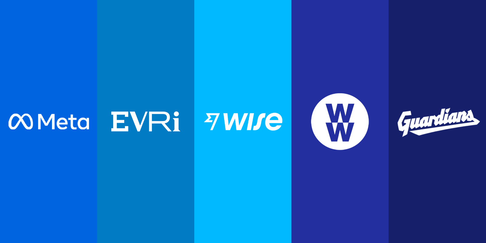
Companies can rebrand for many different reasons, and it’s not uncommon for them to completely pivot in their visual identity as a result. That’s why we’ve listed our top five indicators that it might be time to consider a rebrand.
(If your business has changed, why shouldn’t your branding?)
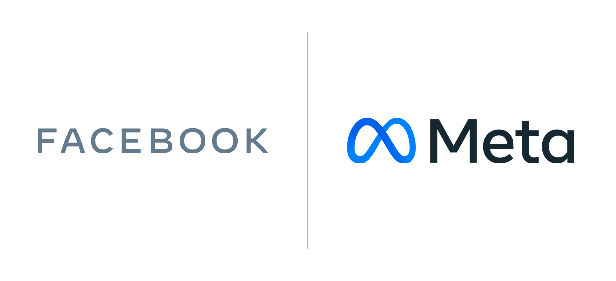
Facebook > Meta – Your mission has evolved
Remember when Facebook was just a tiny platform where you spent your day “poking” your friends back and forth? Or even before that, when The Facebook was a closed community for University students?
Since then Facebook has acquired some major social media platforms – like Instagram and WhatsApp – and over 50 other smaller companies within the tech space. Not only that, but they have also faced major scrutiny in recent years over misinformation and consumer wellbeing.
With so many strings to their bow and a new era on the horizon, Mark Zuckerberg says that having Facebook as the corporate name no longer makes sense.
That’s why Facebook is now Meta – paired with a new infinity-shaped logo, which symbolises the “infinite horizons in the metaverse” according to Meta’s designers. It was created using augmented reality, where a single 3D loop was made to be experienced from different perspectives, much like Zuckerberg’s vision for this fundamental shift in their goals.
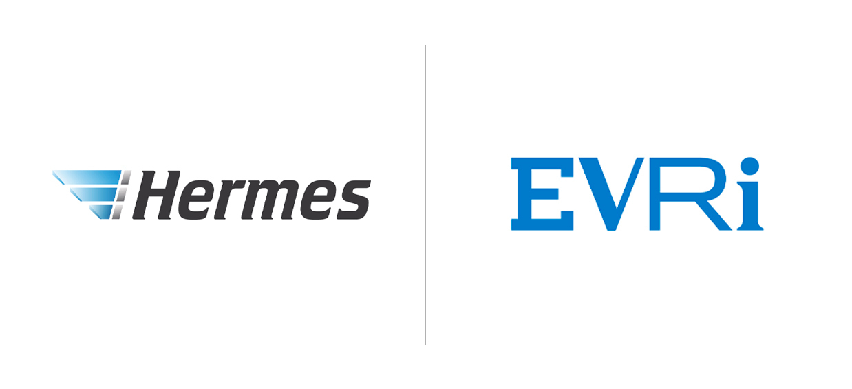
Hermes > Evri – You need a fresh start
Another fast-changing staple of our modern times is home delivery. With the rise of e-commerce over the last ten years, it is now possible to get almost anything delivered straight to your door in a matter of days – or even hours!
Much like Facebook, Hermes has had its fair share of bad press. Not long ago, the company was exposed for poor working conditions and bad parcel handling, the latter being a well-known fact amongst customers.
To signify their multi-million pound investment and massive internal overhaul within the company, Hermes have re-emerged with their new identity: Evri.
The CEO of Evri highlights that “It is more than just a name change – it is a statement of intent of our commitment to leading the way in creating responsible delivery experiences for ‘Evri one’, ‘Evri where’”.
This is also reflected in their completely new branding, the main focus being on a strong typographic concept. The logo (or rather, logos) showcases the diversity represented in the Evri name by using AI technology to always present a different version of the 194,481 possible variations.
TransferWise > Wise – Your audience has changed
![]()
We’ve also seen major innovations in finance as worldwide trade and travel means we are more connected than ever.
Originally built for people who wanted to avoid hidden fees and exchange-rate markups, the Transferwise has now evolved into a handy tool for digital nomads and a staple of international banking. Today, you can do much more than just transfer, but customers still have one thing in common – they are Wise.
The Co-founder of Wise, Kristo Käärmann says it best:
“Today our name catches up with who we’re already building for – a community of people and businesses with multi-currency lives. That community now even includes the banks themselves.”
After reducing the old brand name to its core, Wise now acts as their wordmark. This is neatly placed next to their icon, the “Fast Flag”, which remains a memorable part of their visual identity. They now also have a thorough guide for their tone of voice – placing the emphasis on real-life, conversational copy that positions the company as a trusted friend of the customer.
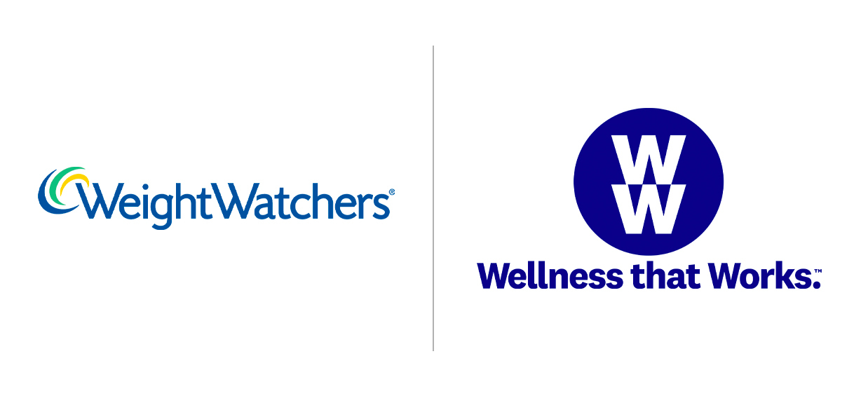
Weightwatchers > WW – Your focus has widened
Since the turn of the century, the societal perspective on health and wellbeing has been slowly evolving. From the size zero advertising era to the now thriving body positivity movement, the meaning of “health” has changed for a lot of us. As an added bonus, low rise jeans are finally out of fashion for good!
In 2018, WeightWatchers rebranded to WW to mimic this shift, sporting the new tagline “wellness that works”. Reflecting the growing views on diet-culture as unhealthy and dangerous, they lost the word weight from their logo completely.
WW are a good example of how a strategic launch and enough context surrounding it are essential to a successful rebrand. Communication needs to be clear and structured to avoid alienating current customers when introducing your new identity.
Their methods and philosophy widely remain the same, but it is commendable that they are reflecting this wider mindset-shift.
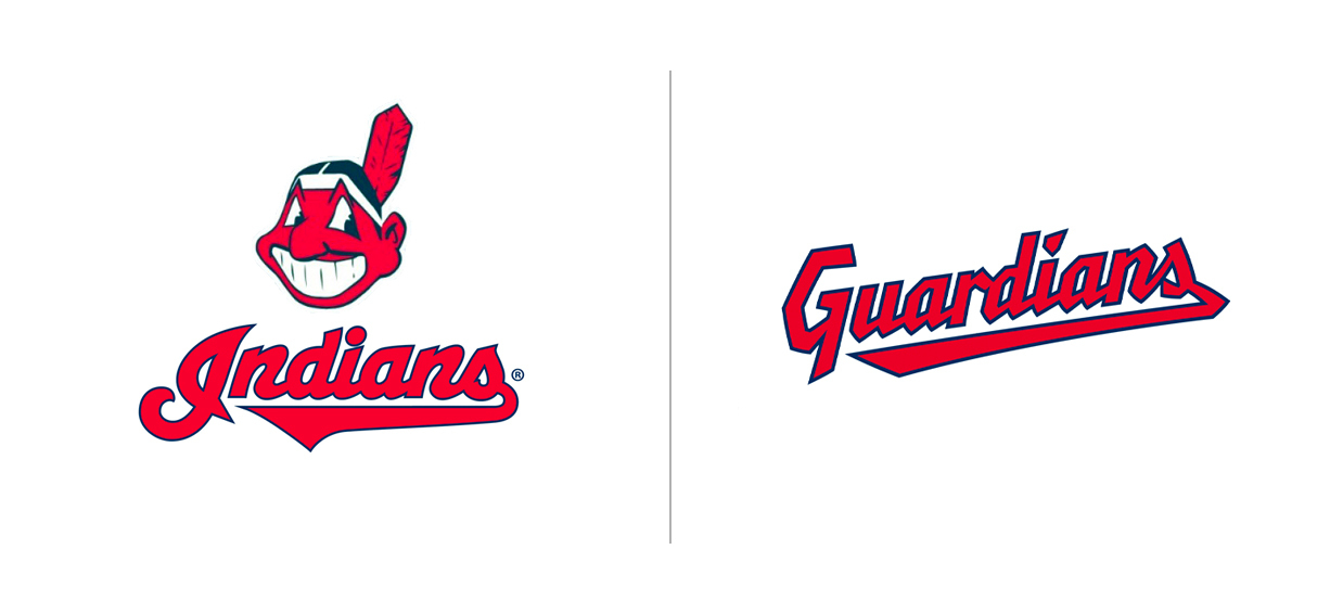
Cleveland Indians > Cleveland Guardians – Your values have shifted
Have you ever seen a company with an unfortunate name and thought “oof, how did they not see this?”
The name of your brand is essential to conveying its personality, so if this name carries negative associations with it, it’s likely to be discarded by many potential customers. Don’t be THAT brand.
The Cleveland Indians baseball team announced in 2020 that they would be changing their name to Guardians to “address many of the social challenges affecting [their] community”. This came after increasing discussions about their brand & mascot perpetuating harmful stereotypes of indigenous communities.
They recognised that this name no longer represented the values they had as an organisation:
“Ultimately, we found our organization is at its best when we can unify our community […] – and we believe a new name will allow us to do this more fully.”
This rebrand underwent extensive research, enormous surveys and many design variations before the internal design team ultimately landed on the Guardians name and brand identity. The name (selected out of the almost 1200 options proposed by fans) takes inspiration from well-known landmarks around the city – aspects that truly everyone in Cleveland can identify with.
The Guardians are a perfect example of how a design team can bring your brand into the 21st Century and demonstrate your values as the core of your business.

Are you in need of a rebrand? Here at Supremo, our team can help you with any of your branding needs. Whether that be a few visual touch-ups or a huge brand overhaul. Simply fill out our project planner or get in touch with Ellie below.
On the other hand. If you’re not sure whether you’re due a re-brand, check out our guide here for help.