Radar Opus
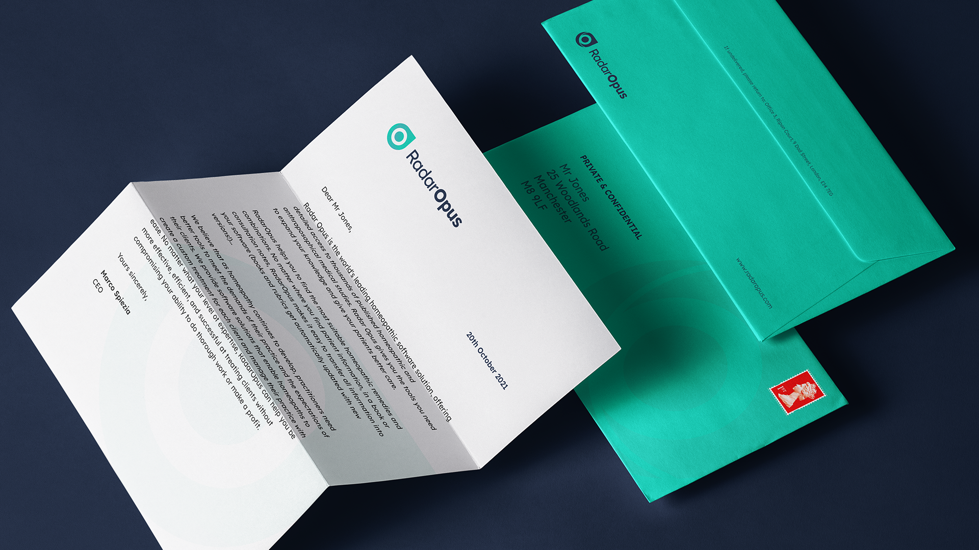
RadarOpus is a software solution for the professional Homoeopath. They strive to empower and inspire homoeopaths by providing a suite of innovative and cutting edge tools aimed at supporting all aspects of clinical practice. We were approached by RadarOpus to assist with the refresh and rollout of their brand identity. They wanted to build upon their existing icon and align the brand with the clean look and feel of their platform.
Services
The marrying of art, science and machinery
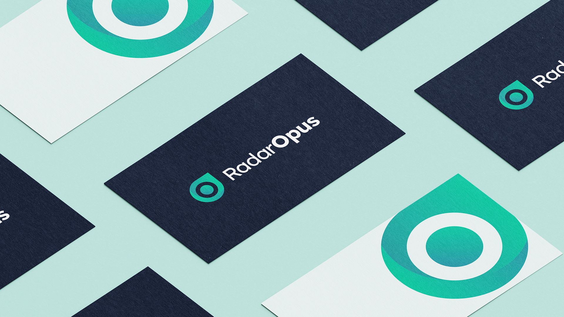
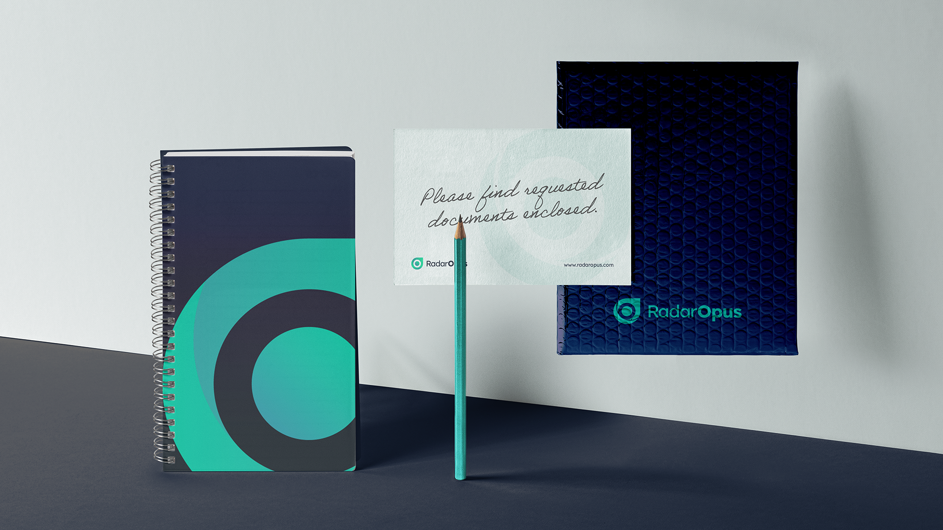
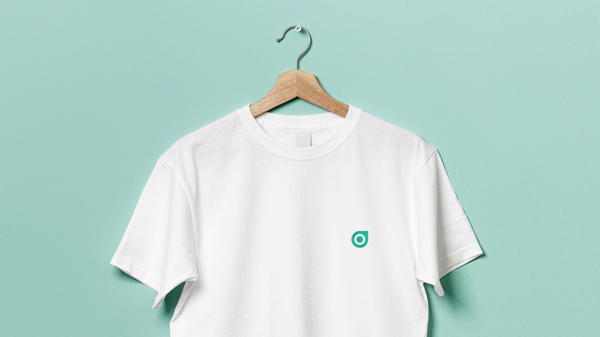
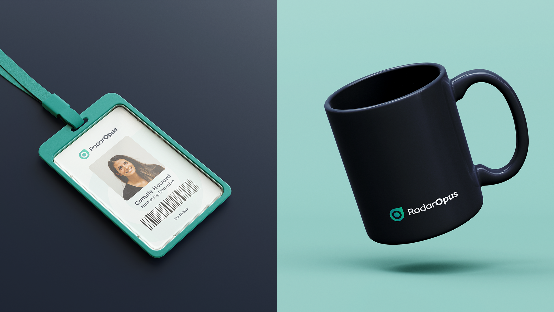
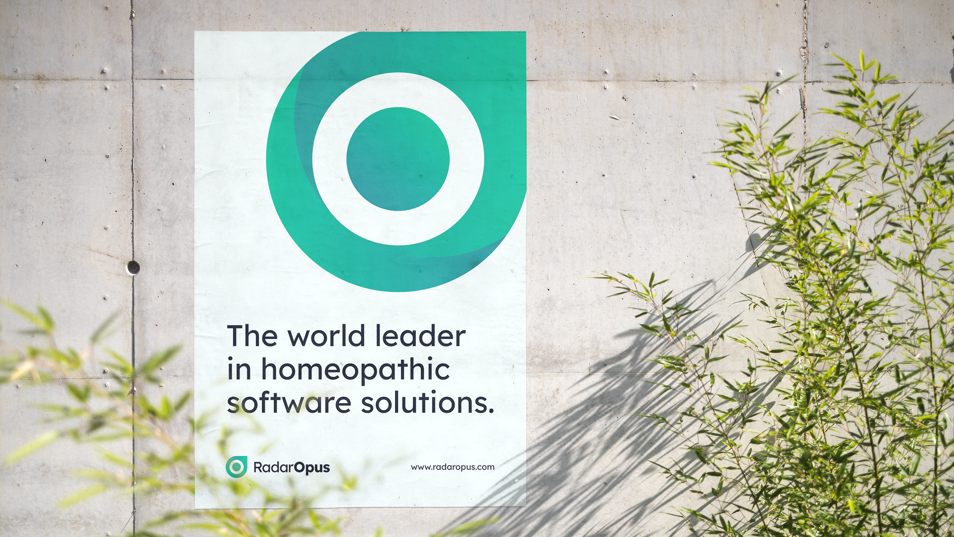
As a brand RadarOpus represents healing and innovation, demonstrating the marrying of art,science and machinery. The refreshed logo needed to visualise this partnership and encompass their brand values.
A brand to carry innovation
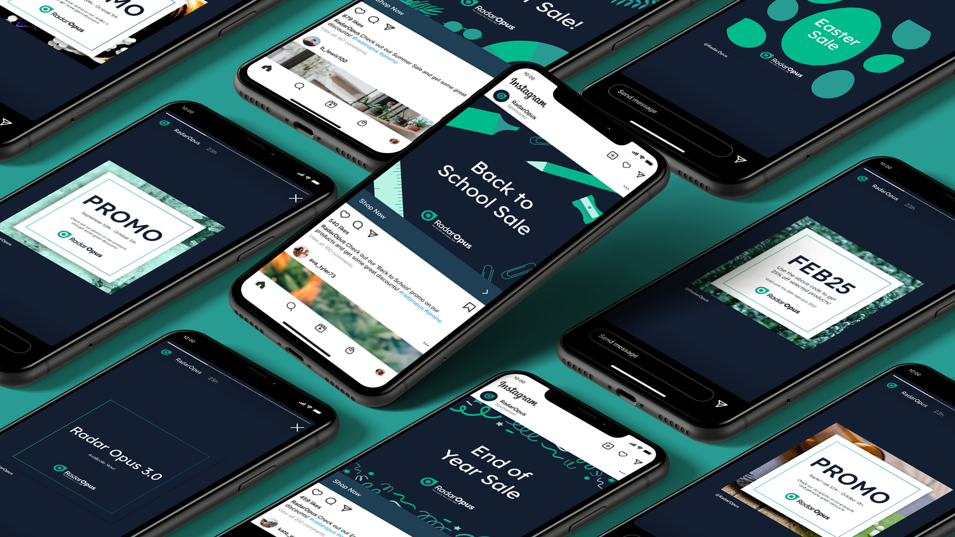
We took the existing brand and modernised the entire aesthetic. We reworked the icon giving it a 3D effect with drop shadow and adding curves. The typeface is clean-cut and modern, the weighted ‘opus’ provides balance and symmetry with the icon. We kept the colour palette soft using greens to reflect the organic and natural elements of homoeopathy. We also introduced a dark blue background colour to support dark mode so their brand and the app design could draw upon its tech-focused roots.

“We loved working with the Supremo team. They were easy to communicate with and managed to deliver exactly what we were looking for.”