EdgeWorks
EdgeWorks is a leading provider of e-learning courses for the health and social care sector. After 25 years in the industry, EdgeWorks needed a refresh to infuse new life into their visual identity and to ensure that their brand truly reflected all the ways in which they serve the HSC sector—beyond e-learning.
Finding the edge
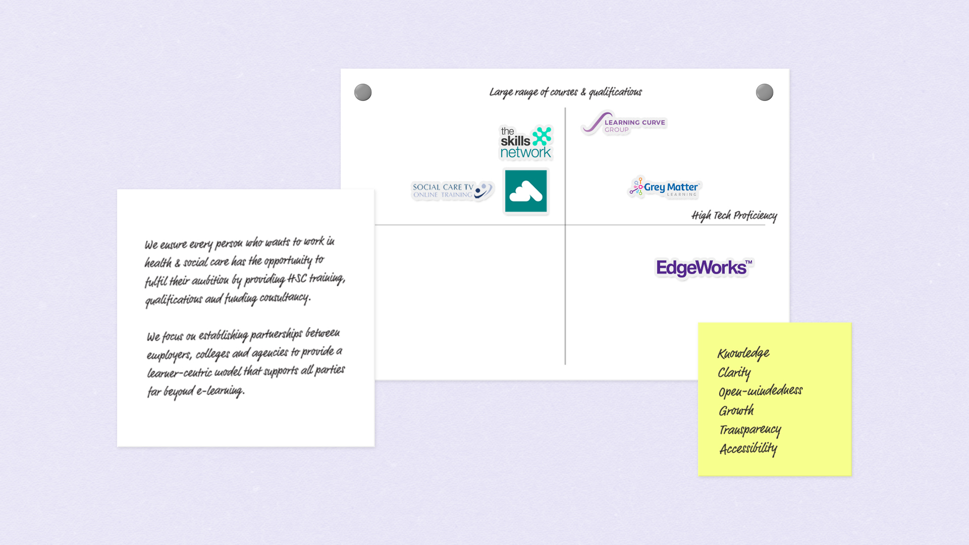
We first met with EdgeWorks’ founders in a live workshop to craft a brand personality and determine a brand strategy.
At the heart of the workshop was uncovering what makes EdgeWorks different from their competitors which, as it turns out, is quite a lot.
Their dedication to going far deeper than just providing e-learning and their founders’ vast knowledge which they were dedicated to sharing with clients were just a few examples of how they differed from more traditional competitors.
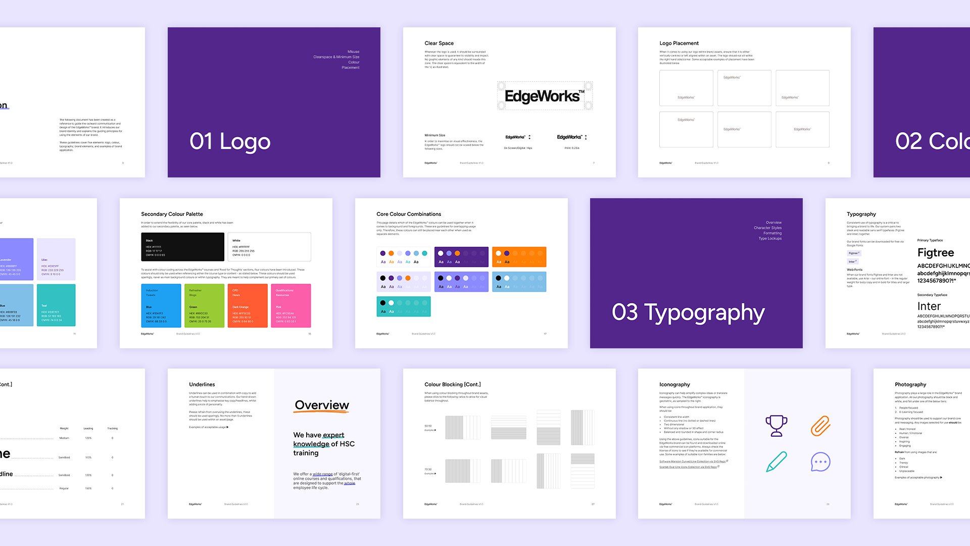
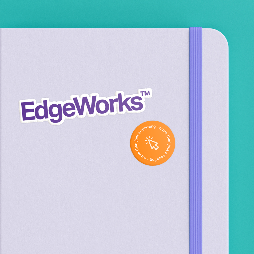
Trusted yet playful
The challenge for our brand designers was to incorporate the findings of the workshop into a realigned identity.
After spending time with the EdgeWorks team, it was clear that the brand aspired to be one that was considerably more approachable than their more traditional competitors operating in health and social care.
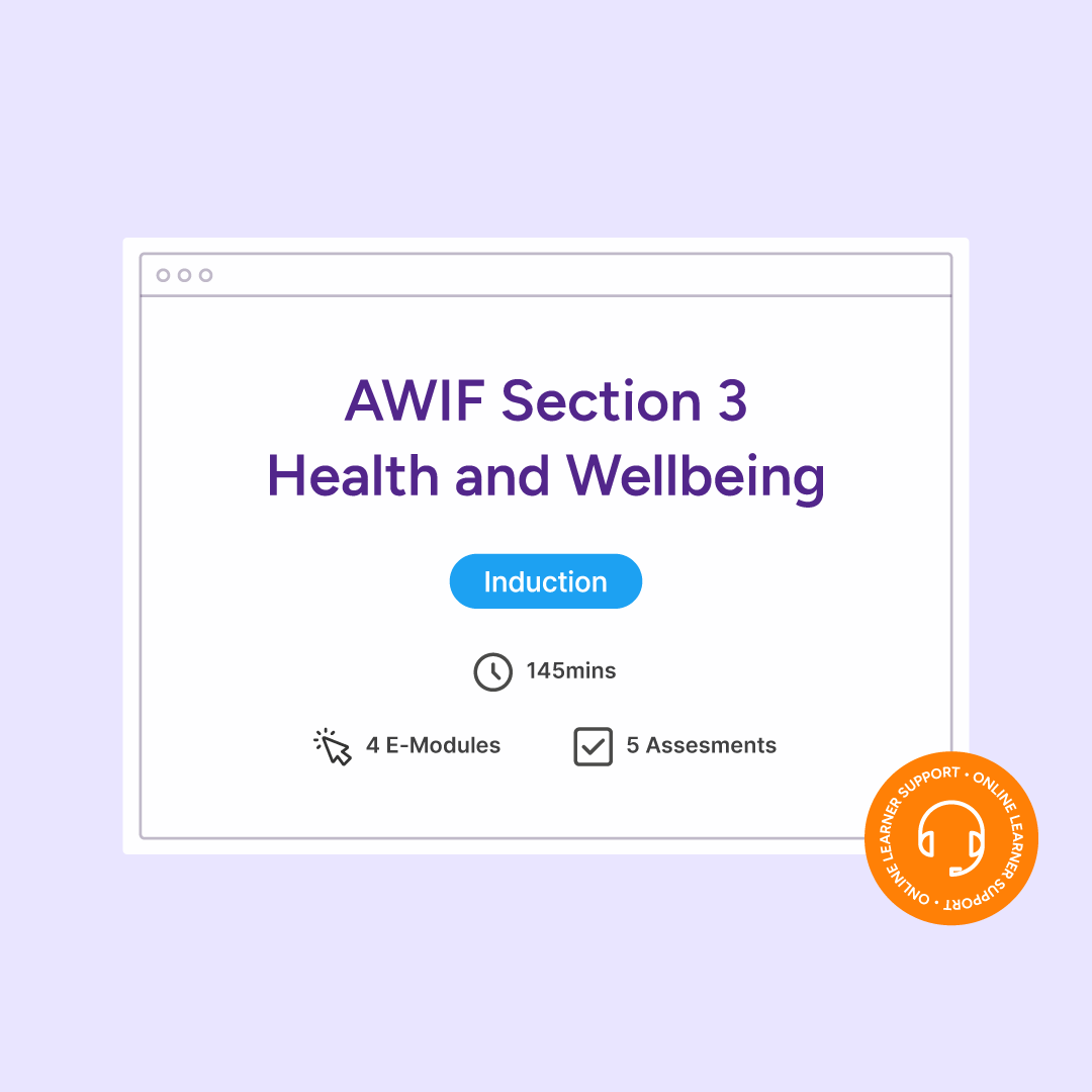
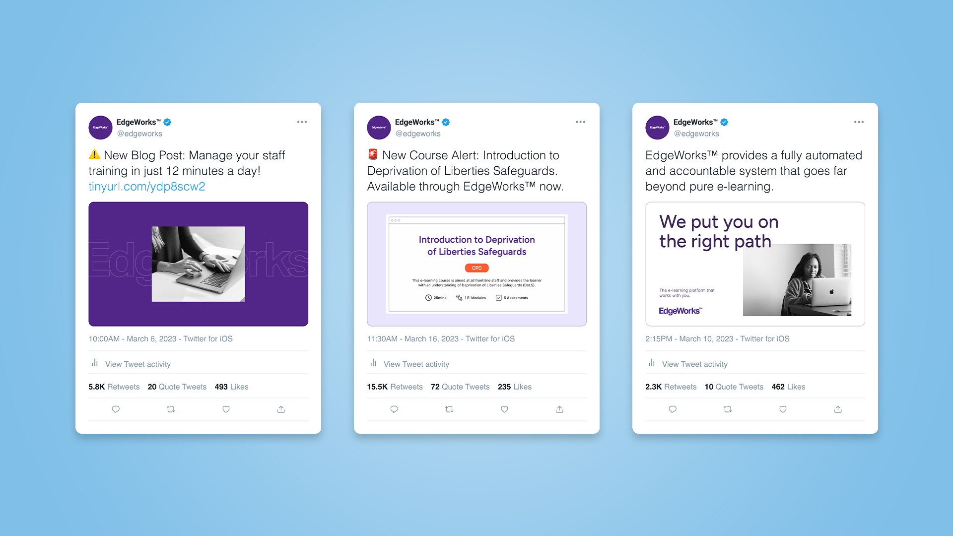
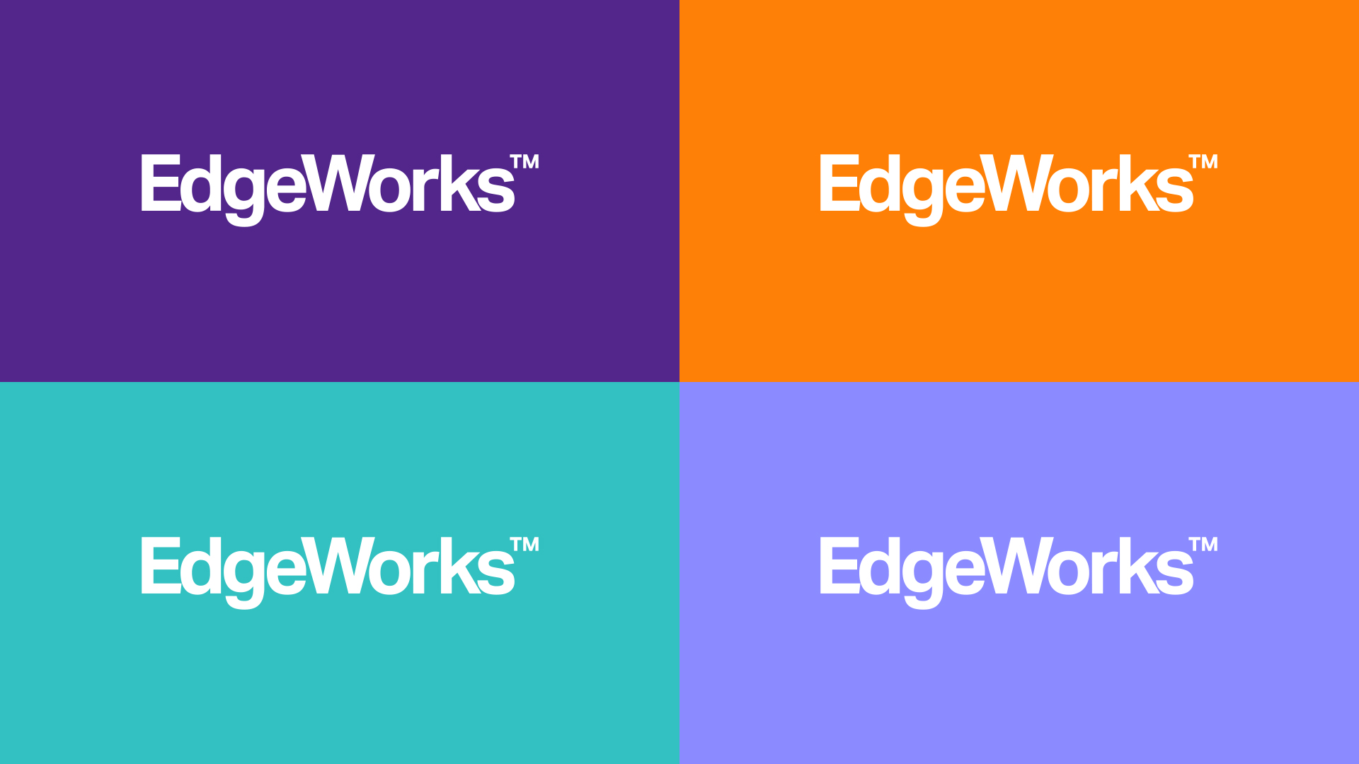
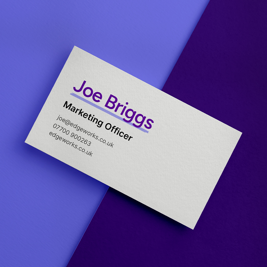
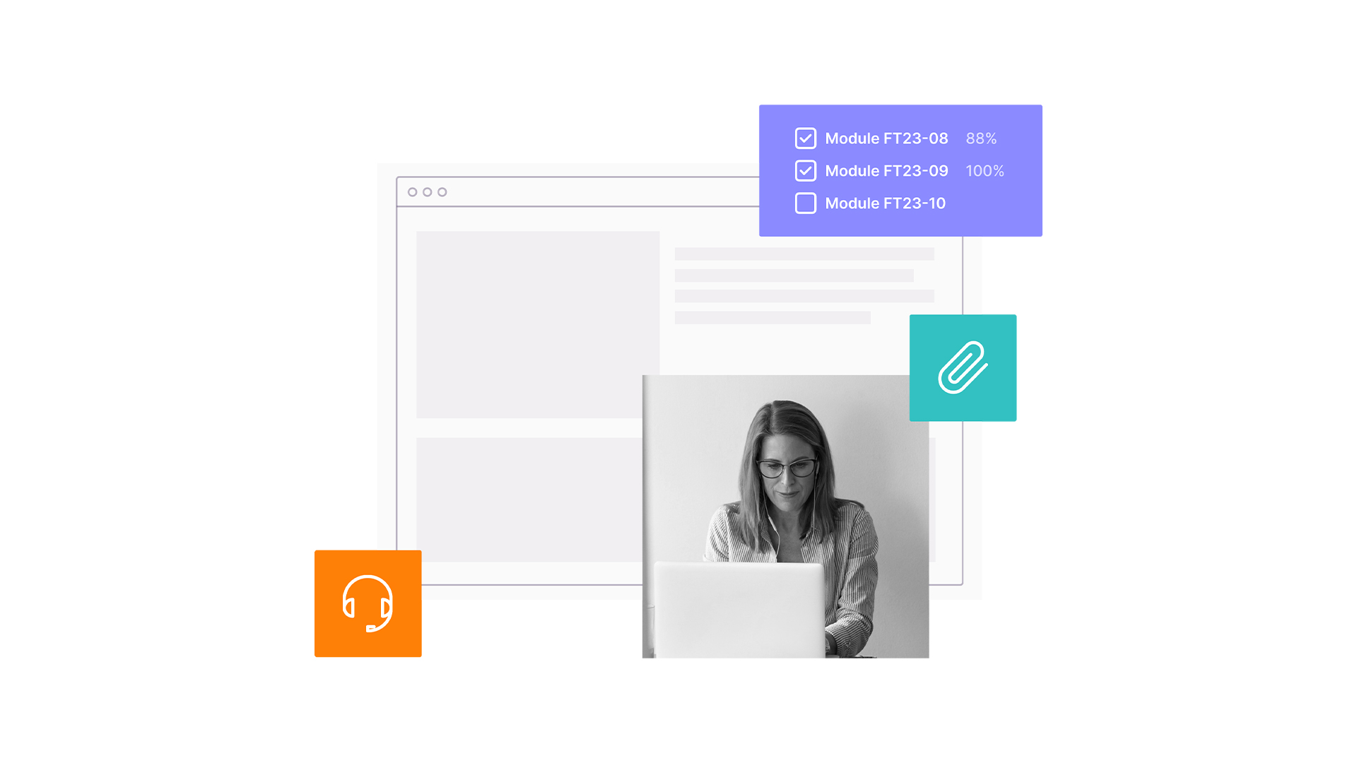
We aimed to bring through the imaginativeness of EdgeWorks’ personality by proposing concepts that were modern, colourful and playful.
At the same time, our aim was to create consistency between the different areas of EdgeWorks’ offering such as their e-learning platform, funding alliance and satellite centres.
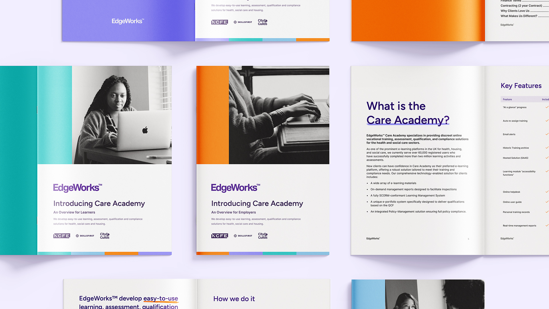
Welcome to EdgeWorks
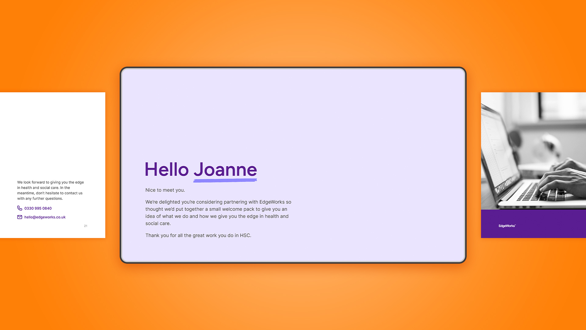
We assisted EdgeWorks with the rollout of their new brand by creating a welcome pack that could be used to onboard potential clients.
We applied our newly crafted brand guidelines to bring through the brand personality during the reader’s very first interaction with EdgeWorks.
We supported the refreshed look with copy that brought through the welcoming, knowledgeable nature of the EdgeWorks team.