A logo is the foundation of a brand, acting as the visual representation of a company. Therefore, it needs to make a strong impression. A well-designed logo is a surefire way to convey to potential customers and clients that your brand is reliable, professional, and provides goods and services of the highest quality.
When designing a logo, there are several things to keep in mind. Our step-by-step guide shows you the essentials needed to create a logo that will win your client over and stand out from the crowd.
Step One: The Logo Design Brief
Before embarking on designing a logo, it’s crucial to find out exactly what your client wants in the design. Conducting a client questionnaire is the quickest and most efficient way to do so. Getting to know your client is essential to understanding what they do and who their target audience is. After all, you’ll be designing their logo with the intended audience in mind. It’s also wise to discover what the client and their business represent, what’s important to them as a brand? What are their values? What tone do they want to set? All these can impact the visual impression that the logo should give off.
Some potential questions for your client questionnaire include:
- Who are your competitors?
- Who is your target audience?
- What is the story behind your brand?
- What message would you like your brand to communicate?
Once the questionnaire is complete, collate all the relevant information into a design brief. The design brief is an integral part of the design process because it defines the client’s visions and what they expect as deliverables.
After completing your design brief, get the client to review it to confirm you both agree on what the task requires. You will often find yourself referring back to this brief as you go through the designing stages, making it crucial that it’s correct and contains all the information you will need.
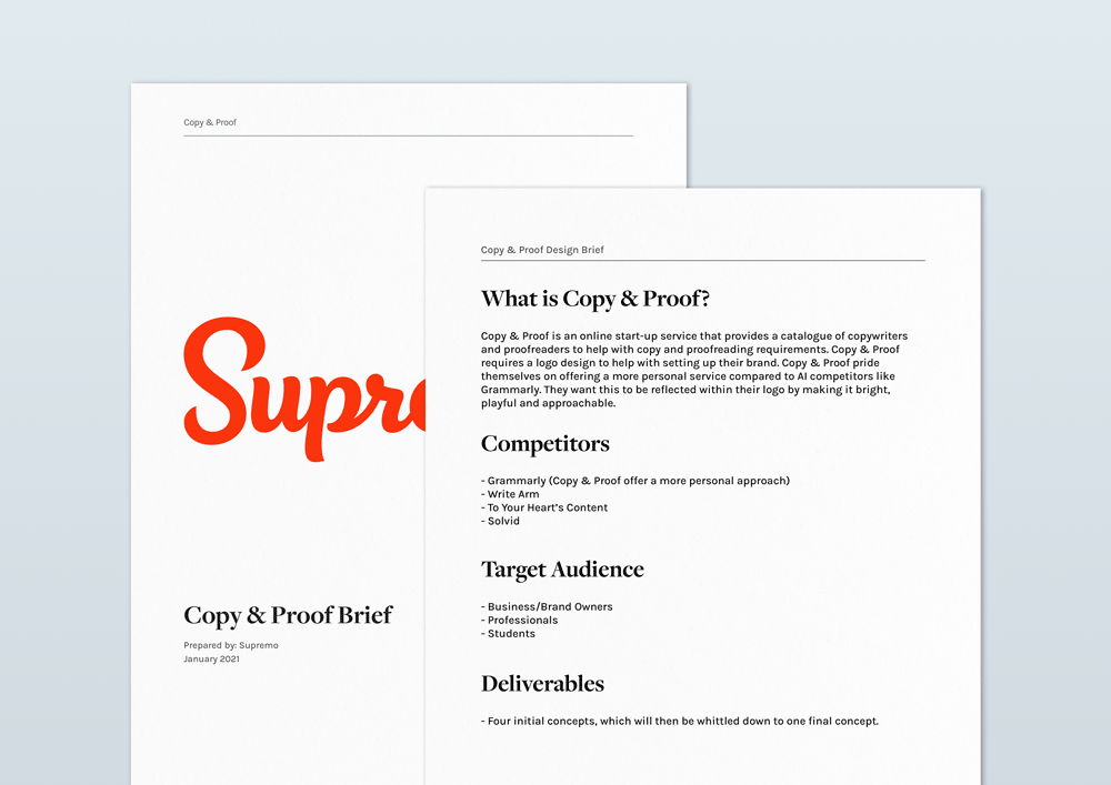
Our Example – Copy & Proof
Copy & Proof is a startup that specialises in providing copywriting and proofreading services to businesses. The client wants a clean, playful logo that represents their simple yet creative business platform. They’ve asked for four initial concepts, from which they will pick which best represents their brand.
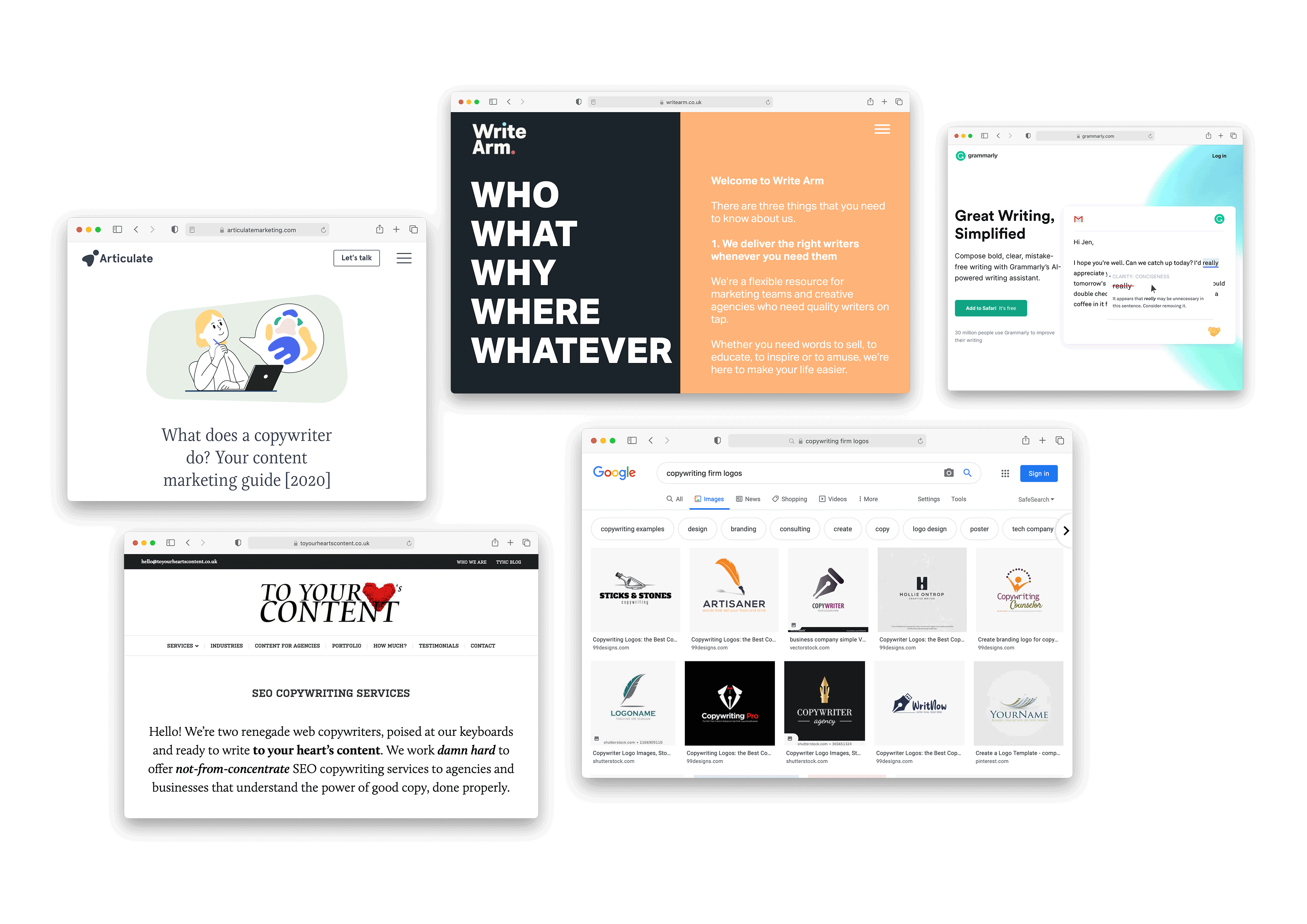
Step Two: Logo Research
Research is a crucial part of the logo design process. It’s helpful to have a solid understanding of the field or industry that your client is in before you move onto the design stage. Begin by researching the industry, referring back to the design brief and any competitors your client identified. Competitor brands matter as you need to design your client’s logo to be the one that catches attention.
We also recommend looking for specific trends in that industry and what appears to be important visually. Your logo design shouldn’t be radically different from industry competitors but unique to make sure it draws in business. It may put people off if your logo is different from the ‘norm’, but it could also be to a brand’s advantage. You can judge this on a case by case basis.
 Step Three: Sketching Logos
Types of Logos
Before you begin to sketch out ideas, it’s worth thinking about what style of logo you want your design to follow. There are four main styles of logos:
- Lettermark (also known as monograms) – These are logos that consist of letters, typically the brand initials. Lettermarks are often used when a brand has a particularly long name, an example being the NASA logo.
- Wordmarks (or logotypes) – Wordmarks are like lettermarks in that they use the business name as the logo. This style is ideal for companies with memorable and distinctive names. Examples of wordmark logos are the Coca Cola and Google logos.

- Brand mark – these are icon-based logos, they don’t feature text and consist simply of an isolated icon. Examples of brand marks are the Apple logo and the Snapchat ghost.

- Combination Mark – these are logos that combine a brand mark with either a letter mark or wordmark. Combination marks are the most frequently used of the logo types as they offer both the visual appeal of an icon, alongside providing the clarity of a brand name. This is the best options for new brands wanting to establish themselves.
Once you’ve got a rough idea of the logo, you’re ready to start designing. Begin by putting all your ideas down on paper – even if they’re simple rough line drawings or sketches. Refer to the design brief and research you carried out to help with design inspiration. Once you’ve got all ideas down and exhausted every creative avenue, have a go at iteration and see what develops.
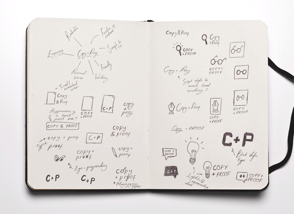 ^ First ideas for Copy & Proof in rough sketches.
When we thought about initial ideas, we were inspired by the company’s services and corporate values. For example, we looked at elements and icons including pages, glasses, speech bubbles, pen nibs and eyes to name a few. When thinking about the layout of the logos and imagery, we chose to look at using simple visuals to represent the relaxed and straightforward nature of the business.
Step Four: Computer Generation
Once you’re happy with your ideas, take a small selection of sketches and experiment with the designs digitally using your programme of choice. At this stage it’s important to focus on translating your ideas digitally, don’t worry too much about colour.
![]() ^ Initial digital logo development for ‘Copy & Proof’
^ Initial digital logo development for ‘Copy & Proof’
Step Five: Logo Colour & Typography
After you have digitally translated your designs, then you can focus on colour and typography.
When thinking about colours, refer back to both the design brief and research carried out in earlier stages. Brush up on colour theory and the psychology of colour as they play a vital role in a brand’s image. A quick tip would be to search up which colours best represent the brand’s values mentioned in your design brief and then progress from there.
Font psychology is just as important when it comes to designing a logo. There are three main font categories, and they invoke different impressions:
- Serif fonts – these are most suitably used when attempting to show that a brand is established and has heritage.
- Sans Serif fonts – these are best used when wanting to give off an impression of a brand being modern, trustworthy and straightforward.
- Script fonts – these are used to invoke a sense of elegance and sophistication, along with appearing traditional. However, script fonts should be used sparingly as they can sometimes become illegible.
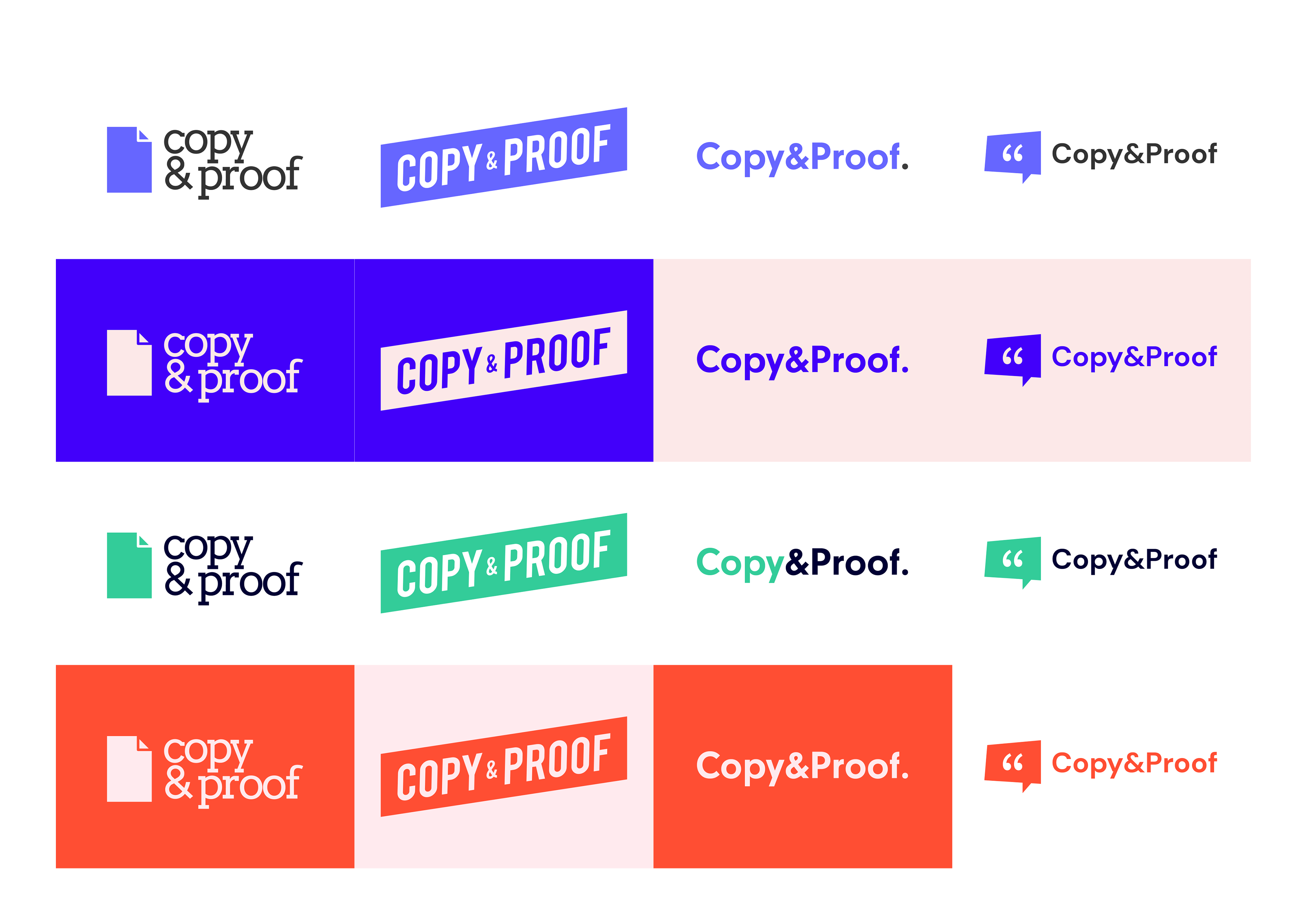 ^ Testing the logos in different colours
The client wanted a ‘playful’ logo, giving us the freedom to experiment with bright and unconventional colours. We decided to use colours commonly seen in the industry, including greens, oranges and blues:
- Green symbolises freshness and progress
- Orange aligns itself with creativity
- Blue is often associated with wisdom and confidence
When it came to selecting what typeface to feature within the designs, we choose sans serif typefaces. This font type is both modern and simple, two attributes that suit Copy & Proof’s identity.
Step Six: Final Revisions
Once satisfied with your logo concepts, assemble them into a pitch deck to send over (or pitch live) to your client. When deciding what to include in your pitch deck, consider creating some mock-ups of your logo concepts in situ. They will help visualise how a logo can convert and roll out into a brand. For example, use business card mock-ups, letterheads or office signage. It also aids the client in understanding your vision as to how colour and type can spill out into brand elements down the line.
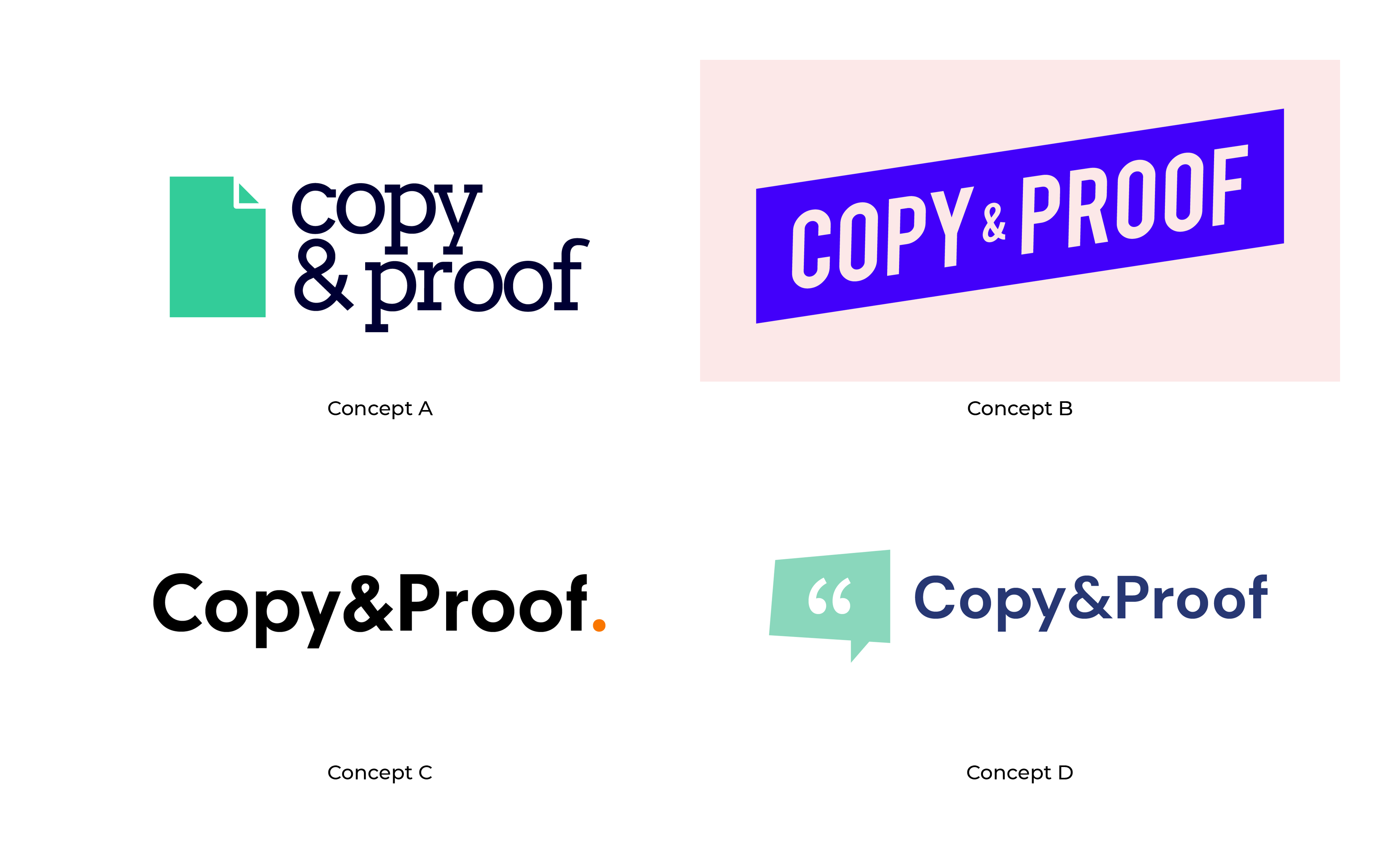 ^ Final four concepts ready for presenting to client
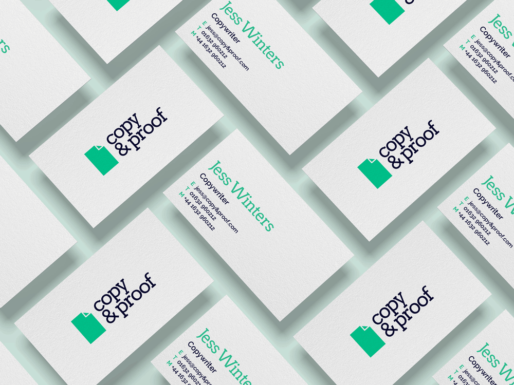 ^ Example of a mockup provided to the client to show the potential logo in situ
Depending on your arrangement with the client, they might ask for several revisions. By taking the time to do your research these are likely to only be minor changes. That’s why the research stage is just as important as the designing stage, as it makes the process easier for both the client and yourself.
![]()
^ The client chose ‘Concept D’, but preferred the colours used in ‘Concept B’. After changing the colours, the client approved the logo.
Step Seven: Prepare and Deliver the Logo
Finally, ask the client for any final revisions and confirm that they’re happy with their new logo. Then package up the files and send them over to the client.
Those are our seven easy steps to designing a logo. As you now know, logos are integral aspects of a brand’s visual language. Once you have nailed the design, everything else within a brand’s image should (fingers crossed) fall into place.
Want to give your logo and branding a refresh? Start your branding project with our experts here at Supremo. Simply fill out our project planner or get in touch with Ellie below.