Branding and UI design are two things that go hand in hand. UI designers work with branding elements when designing user interfaces which come together to fit like pieces of a puzzle.
Any UI design, whether it be an app or webpage, needs to act as an extension of the brand. A website won’t be efficient in gaining brand loyalty and trust if its visual interface doesn’t contain recognisable elements of the brand. There needs to be a distinct visual flow between branding and interfaces.
UI Designers work with branding elements like logos, colour palettes, typography, and imagery when designing. For any design to be effective, all of these elements need to be locked down. If the UI designer is provided with all of these, the final result will be an interface that runs smoothly alongside the brand.
Here’s how those elements are used within UI design:
Logo
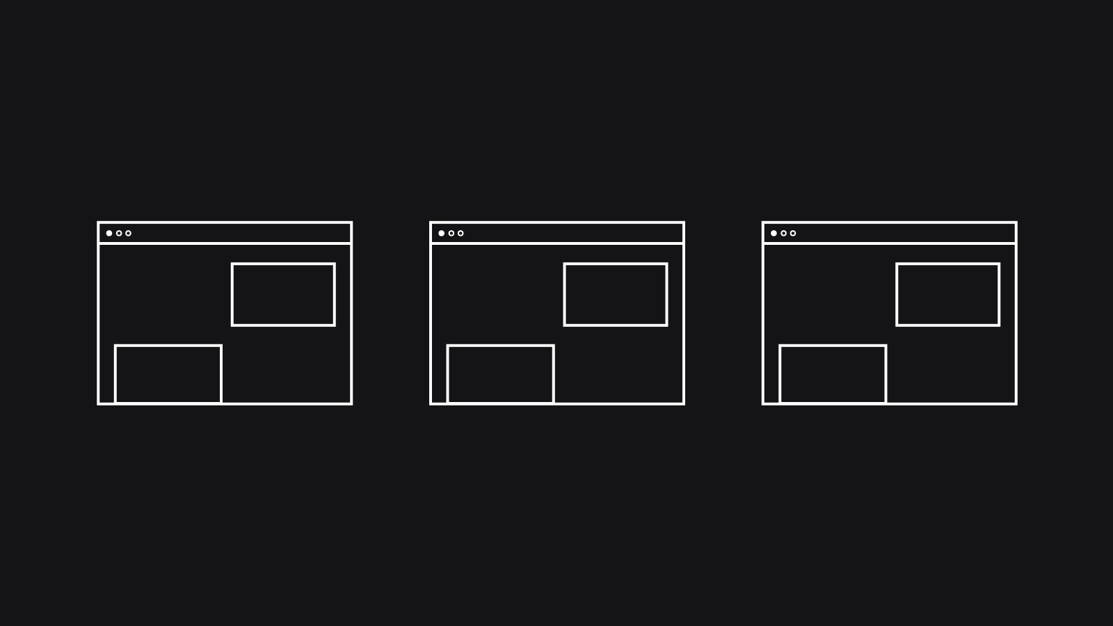
It’s been claimed that 75% of people recognise a brand by its logo first. Logos are the backbone of a brand’s visual identity, everything else stems off from that. Therefore when designing a user interface, the logo should be one of the first things considered. It’s standard for a logo to be placed somewhere in the header, as well as in the footer. As a result, the logo is one of the first things a user sees when they load the webpage and can instantly make the connection between the brand and interface.
![]()
^ Examples of how Boots and the National Trust position their logos within their websites. By placing their logos at the top of the page, it ensures that their logos are one of the first things a user sees when visiting their websites.
Colour
UI Designers will use a brand’s colour palette to pick out which colours to use for backgrounds, text, buttons, and other UI elements. Colour plays a huge visual role in both branding and UI design, so it’s important for colours to be consistently used across print and digital interfaces.
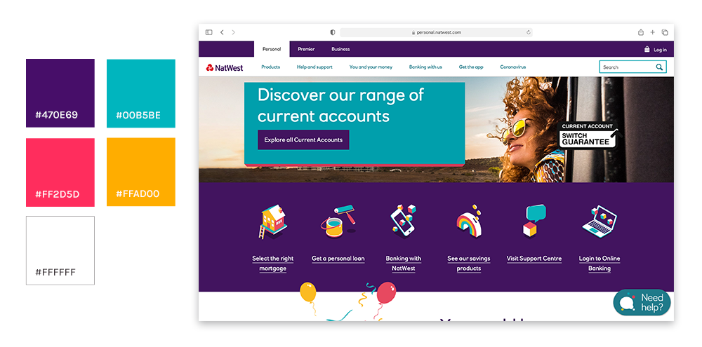
^ An example of how the Natwest colour palette (left) has been injected into their UI design. They’ve used purple as one of the most prominent colours, then brighter colours are used to add bursts of colour. Natwest’s website is a prime example of brands sticking to their colours to keep branding consistent across print and digital.
Typography
UI designers will use any typefaces specified in the branding guidelines when they come to inserting titles, subtitles, copy blocks and any other element of texts. Branding guidelines specify which typefaces should be used for different textual elements. Therefore this can be easily carried across by UI designers when designing.
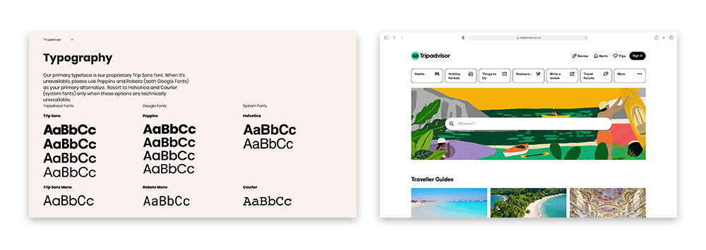
^ An example of how Tripadvisor has followed its brand guidelines when it comes to typography. The guidelines advise that their font ‘Trip Sans’ should be used for titles and ‘Trip Sans Mono’ for body copy. The guidelines also make recommendations for ‘web safe’ fonts that can be used when Trip Sans isn’t available for use. By covering all possible bases when it comes to typography, Tripadvisor ensures that its brand will stay consistent across all platforms.
Imagery
Brand guidelines tend to include specifics as to what style of imagery should be used within branding. UI designers will use the imagery guidelines when looking for stock imagery to place within their designs.
Alternatively, UI designers can be provided with standard imagery and illustrations that fit within the brand guidelines – which they will then take and insert into the UI designs.
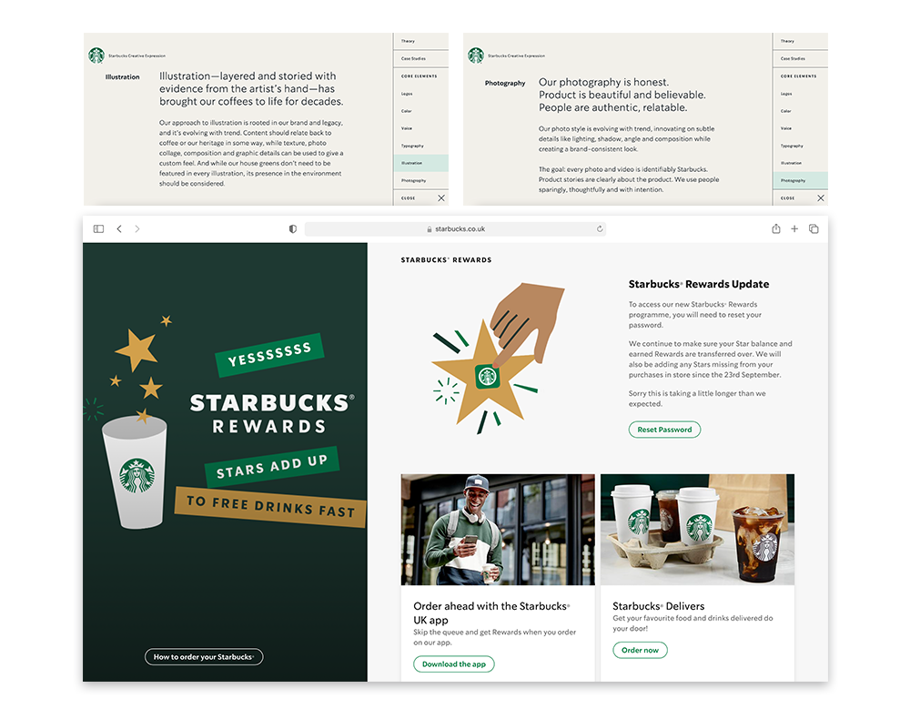
^ Starbucks gives detailed advice when it comes to imagery used across their brand. Starbucks’ brand guidelines stipulate that illustration used within their branding should evolve with trends, and suggest that the use of textures would be ideal. They also recommend that, where possible, their ‘Starbucks green’ shades should be used within illustrations. The above example of Starbucks’ current homepage achieves this. The illustrations used are on-trend, contain texture – and most importantly they contain ‘Starbucks green’.
Overall, branding plays an important role in UI design. Branding elements act as pieces that slot together with UI elements to get the perfect result. Creating a UI interface that works well for the user and is relevant to the brand.
Here at Supremo, our team can help you with any of your UI and branding needs. Whether that be creating a strong brand that can be utilised in UI design or using your existing branding elements to create a powerful user interface (or even both!), our team is on hand to help. Simply fill out our project planner or get in touch with Ellie below.